

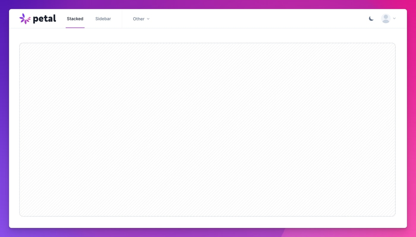
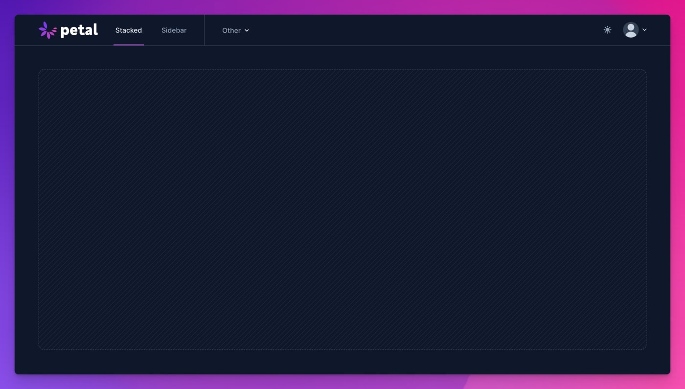
Layouts
A stylish, responsive layout system for your web app. Choose sidebar or stacked, each with a light and dark version.
:collapsible attribute)
How to access
Access options
This comes with the Petal Framework private hex package. Purchase a membership to get access to this package. It can be used with any Phoenix project. Post-expiration, you'll retain access but won't be eligible for updates from newer versions.
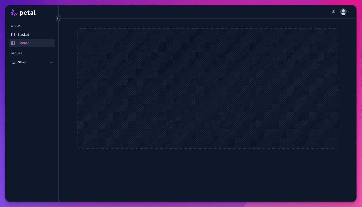
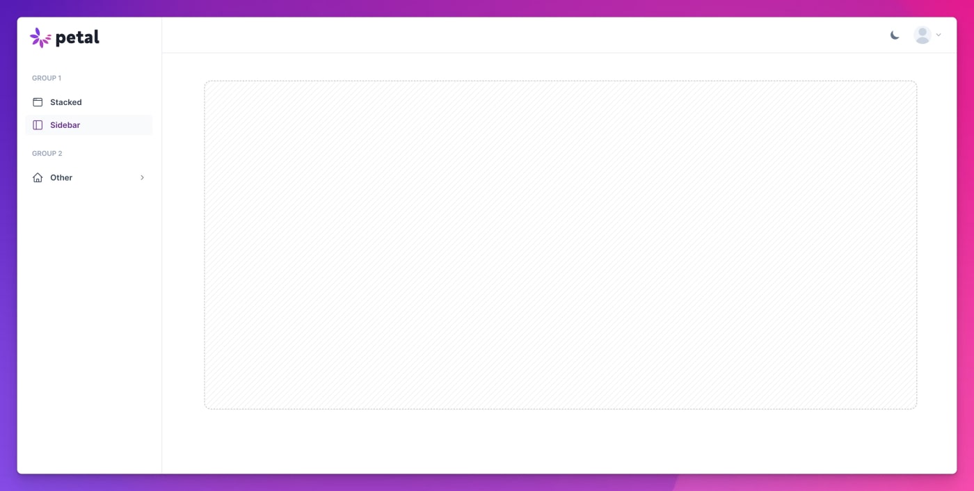
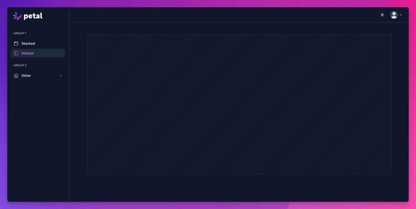
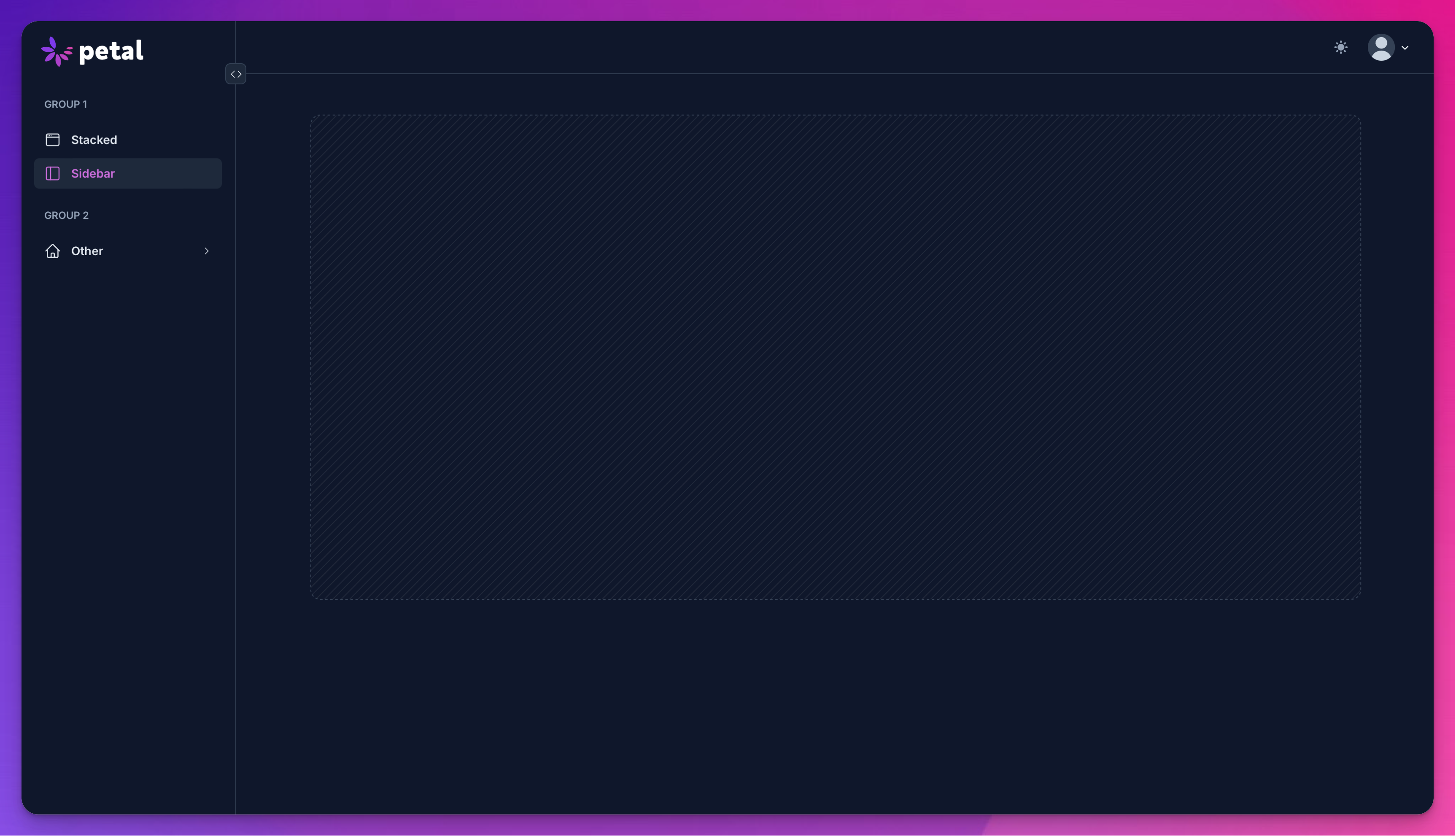
Sidebar layout
Our sidebar layout should suit most of your needs to get up and running quickly. We’ve tried hard to make it work out of the box, but also be customizable.
Standard
Collapsible
Expanded

Collapsed


A quick example:
Learn more about:
- Customizing the header or sidebar
- Upgrading to the collapsible sidebar in Petal Pro 1.8 / Petal Framework 0.8
- Sidebar layout properties
- Installing a layout (common to all layouts)
- Menu item structure (common to all layouts)
- Handling signed in users (common to all layouts)
Customizing the header or sidebar
You can add things next to the user avatar in the header with a slot. Here’s an example:
<.sidebar_layout ...>
  <:top_left>
    This goes on the left side of the header
  </:top_left>

  <:top_right>
    This goes on the right side of the header, to the left of the user dropdown.
  </:top_right>

  <:sidebar>
    This goes in the sidebar (under the menu items).
    You omit `main_menu_items` if you like and just use this.
  </:sidebar>
</.sidebar_layout>
Upgrading to the collapsible sidebar in Petal Pro 1.8 / Petal Framework 0.8
As of Petal Pro 1.8 / Petal Framework 0.8, the sidebar layout has been updated to be collapsible by providing the :collapsible attribute.
If you’re upgrading from Petal Pro 1.7 or Petal Framework 0.7, you must make a few changes for it to work.
-
You must now include the Alpine Persist plugin in your app
<head>. This is used to ensure the chosen sidebar state is maintained across page loads. For example:
          <!-- Alpine Plugins -->
<script defer src="https://cdn.jsdelivr.net/npm/@alpinejs/persist@3.x.x/dist/cdn.min.js">
</script>
<!-- Alpine Core -->
<script defer src="https://cdn.jsdelivr.net/npm/alpinejs@3.x.x/dist/cdn.min.js">
</script>
-
The
:sidebar_width_classattribute on the sidebar layout previously called for alg:prefixed width class - in order to accomodate collapsibility this is no longer the case. If you’re not using the default (i.e not providing the attribute explicitly), yourlg:prefixed width class must be provided to a new attr -:sidebar_lg_width_class- alongside:sidebar_width_classwhich must also be provided but with the non-prefixed equivalent. E.g.lg:w-64andw-64respectively. -
You must also provide markup for the new
:logo_iconslot. This is the logo rendered when the sidebar is collapsed, so it should be an image of your logo glyph without the usually corresponding brand text which increases the width. For example:
          <.sidebar_layout collapsible {assigns}>
  <:logo>
    <Brand.logo />
  </:logo>
  <:logo_icon>
    <Brand.logo_icon />
  </:logo_icon>
  <!-- ... -->
</.sidebar_layout>
Now you can add the :collapsible attribute to the sidebar_layout component. Also available are the :collapsed_only and :default_collapsed attributes.
Note that :default_collapsed may appear not to work if the state has been set by the user as expanded - as the choice is persisted in localStorage.
Sidebar layout properties
            # <.sidebar_layout>
  attr :collapsible, :boolean, default: false, doc: "The sidebar can be collapsed to display icon-only menu items. False by default. Requires the Alpine Persist plugin."
  attr :collapsed_only, :boolean, default: false, doc: "The sidebar is always collapsed and cannot be toggled otherwise. This makes the `:collapsible` and `:default_collapsed` options unnecessary."
  attr :default_collapsed, :boolean, default: false, doc: "The sidebar will render as collapsed by default, if it is not already set in localStorage. False by default. Requires `:collapsible` to be true."
  attr :current_page, :atom, default: nil, required: true, doc: "The current page. This will be used to highlight the current page in the sidebar menu."
  attr :main_menu_items, :list, default: [], doc: "The items that will be displayed in the main menu in the sidebar."
  attr :user_menu_items, :list, default: [], doc: "The items that will be displayed in the user menu."
  attr :avatar_src, :string, default: nil, doc: "The src of the avatar image. If this is not present, the user's initials will be displayed."
  attr :current_user_name, :string, default: nil, doc: "The name of the current user. This will be displayed in the user menu."
  attr :sidebar_title, :string, default: nil, doc: "The title of the sidebar. This will be displayed at the top of the sidebar. If you are using groups, you won't need this."
  attr :home_path, :string, default: "/", doc: "The path to the home page. This will be used for the logo link."
  attr :sidebar_width_class, :string, default: "w-64", doc: "The width of the sidebar when open on breakpoints below :lg."
  attr :sidebar_lg_width_class, :string, default: "lg:w-64", doc: "The width of the sidebar. Must have the lg: prefix."
  attr :sidebar_bg_class, :string, default: "bg-white dark:bg-gray-900"
  attr :sidebar_border_class, :string, default: "border-gray-200 dark:border-gray-700"
  attr :header_bg_class, :string, default: "bg-white dark:bg-gray-900"
  attr :header_border_class, :string, default: "border-gray-200 dark:border-gray-700"
  slot :inner_block, required: true, doc: "The main content of the page."
  slot :top_left, required: false, doc: "The top left bit of the header. You can use this to add things like a search bar or more menu items. Will disappear on mobile."
  slot :top_right, required: false, doc: "The top right bit of the header. You can use this to add things like a notification badge."
  slot :logo, required: false, doc: "Your logo. This will automatically sit within a link to the home_path attribute."
  slot :logo_icon, doc: "Your logo icon for display when the sidebar is collapsed. This will automatically sit within a link to the home_path attribute."
  slot :sidebar, required: false, doc: "Optionally add whatever you like to the sidebar. If main_menu_items is present, this will sit under that. Or you can leave main_menu_items as empty and create your own menu."
Stacked layout
Get up and running
You’ll notice this is called with the same arguments as the sidebar component example. That’s because the same data structure for menu items is used. Our goal is to make it easy to switch between layouts. Your job is to maintain a list of menu items.
- Customizing the header or sidebar
- Stacked layout properties
- Installing a layout (common to all layouts)
- Menu item structure (common to all layouts)
- Handling signed in users (common to all layouts)
To get it working in your application, try putting this in your layout file. You can put it in app.html.heex or create a new one called sidebar.html.heex. If you create a new one, then make sure to set it up properly.
Stacked layout properties
            # <.stacked_layout>
  attr :current_page, :atom, default: nil, required: true, doc: "The current page. This will be used to highlight the current page in the sidebar menu."
  attr :main_menu_items, :list, default: [], doc: "The items that will be displayed in the main menu in the sidebar."
  attr :user_menu_items, :list, default: [], doc: "The items that will be displayed in the user menu."
  attr :avatar_src, :string, default: nil, doc: "The src of the avatar image. If this is not present, the user's initials will be displayed."
  attr :current_user_name, :string, default: nil, doc: "The name of the current user. This will be displayed in the user menu."
  attr :home_path, :string, default: "/", doc: "The path to the home page. This will be used for the logo link."
  attr :container_max_width, :string, default: "lg", values: ["sm", "md", "lg", "xl", "full"], doc: "The max width of the container in the header. This should match your main content container."
  attr :hide_active_menu_item_border, :boolean, default: false, doc: "Whether to hide the border on the active menu item."
  attr :main_bg_class, :string, default: "bg-white dark:bg-gray-900", doc:"The background color of the main content area."
  attr :header_bg_class, :string, default: "bg-white dark:bg-gray-900", doc:"The background class for the header."
  attr :header_border_class, :string, default: "border-gray-200 dark:border-gray-700", doc: "The border class for the header."
  attr :sticks, :boolean, default: false, doc: "Whether the navbar sticks to the top."
  slot :inner_block, required: true, doc: "The inner block of the layout. This is where you should put your content."
  slot :top_right, required: false, doc: "The top right of the header. This could be used for a color scheme switcher, for example."
  slot :logo, required: false, doc: "A slot to render your logo in. This will be wrapped in a link to the home_path attribute."
Installation
A layout should really be defined in one spot. Phoenix has already thought of this and gives you a “root” layout and an “app” layout. The “root” layout is rendered only on the initial request and therefore it only has access to the @conn assign. The “app.html.heex” layout is rendered with either @conn or @socket.
Since you likely want access to the @socket it’s better to define your layout in the “app” layout. This is called app.html.heex or you could create a new one called sidebar.html.heex.
If you create a new one, then make sure to let your live views know how to use it..
Here is an example of an app layout that uses the sidebar layout:
          <.flash_group flash={@flash} />
<.sidebar_layout
  main_menu_items={[
    %{
      name: :dashboard,
      label: "Dashboard",
      icon: :home,
      path: ~p"/"
    },
  ]}
  user_menu_items={[]}
  current_page={@current_page}
>
  <:logo>
    LOGO GOES HERE
  </:logo>

  <%= @inner_content %>
</.sidebar_layout>
Note that you will need @current_page defined in every view.
For live views you can do this in your mount function. It’s good to also define a page_title, which will update the <title> meta tag:
def mount(_params, _session, socket) do
  socket = assign(socket,
    current_page: :dashboard,
    page_title: "Dashboard"
  )

  {:ok, socket}
end
For controllers you can do this in your action function:
def index(conn, _params) do
  conn
  |> assign(:current_page, :dashboard)
  |> assign(:page_title, "Dashboard")
  |> render("index.html")
end
Menu items
main_menu_items is a list of items that will be displayed in the main section of a layout. For the sidebar layout it will be in the sidebar. For the stacked layout, it will be in the header up top.
Each item in the list is an Elixir map with the following keys:
-
name- The name of the menu item. This will be used to highlight the current page in the menu. -
label- The text that will be displayed in the menu. -
icon- The icon that will be displayed next to the label. This should be a valid Heroicon name. You can also use a raw HTML string here or pass a function that renders a component (eg.&my_cool_icon/1). -
path- The path that the user will be taken to when they click the menu item. -
patch_group- An optional key to match menu items that link to one live view and thus can use thepatchfunctionality
Here’s an example:
[
  %{
    name: :dashboard, # If this matches the `current_page` prop, it will be highlighted
    label: "Dashboard",
    icon: "home",
    path: ~p"/"
  },
  %{
    name: :settings,
    label: "Settings",
    icon: "cog",
    path: ~p"/settings"
  }
]
Nested menu items
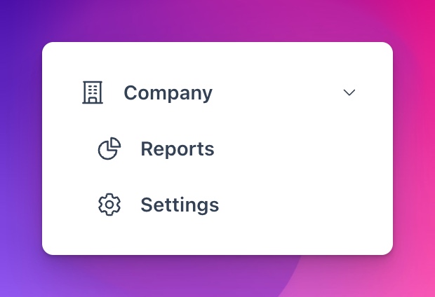
You can have nested menu items that are exposed via a dropdown. The dropdown works via Alpine JS, so you’ll need to have that installed. Here’s an example:
[
  %{
    name: :company,
    label: "Company",
    icon: :building_office,

    # These menu items are nested under the dropdown:
    menu_items: [
      %{
        name: :company_reports,
        label: "Reports",
        icon: :chart_pie,
        path: ~p"/company/reports"
      },
      %{
        name: :company_settings,
        label: "Settings",
        icon: :cog_6_tooth,
        path: ~p"/company/settings"
      }
    ]
  }
]
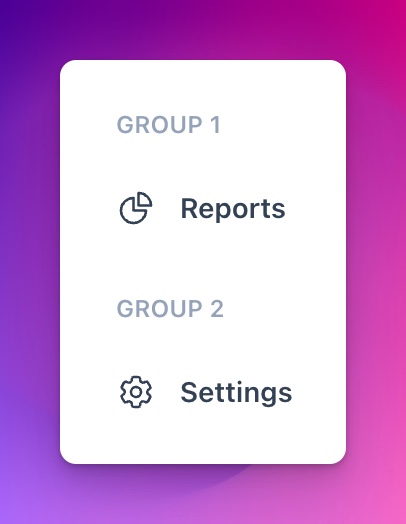
Grouped menu items
You can have multiple groups of menu items. This is useful if you want to separate your menu items into different sections. Here’s an example:
[
  %{
    title: "Group 1",
    menu_items: [
      %{
        name: :company_reports,
        label: "Reports",
        icon: :chart_pie,
        path: ~p"/company/reports"
      },
    ]
  },
  %{
    title: "Group 2",
    menu_items: [
      %{
        name: :company_settings,
        label: "Settings",
        icon: :cog_6_tooth,
        path: ~p"/company/settings"
      }
    ]
  }
]
User menu items
Note that the same menu item format applies for the user_menu_items. These are displayed in the dropdown for the user profile in the top right of the header. You can’t do nesting or grouping there though.
Patching between menu items
If two or more menu items link to one live view, then when you travel between them a patch can be performed instead of live navigation or a full page reload. Patching can mean a faster transition between pages.
Let’s say you have a live view called YourAppWeb.SettingsLive that handles user setting pages. You can set the patch_group key to YourAppWeb.SettingsLive for each menu item that links to that live view. Then when you travel between those pages, a patch will be performed. For example:
[
  %{
    name: :settings,
    label: "Settings",
    icon: "cog",
    path: ~p"/settings",
    patch_group: YourAppWeb.SettingsLive
  },
  %{
    name: :settings_profile,
    label: "Profile",
    icon: "user",
    path: ~p"/settings/profile",
    patch_group: YourAppWeb.SettingsLive
  },
  %{
    name: :settings_billing,
    label: "Billing",
    icon: "credit-card",
    path: ~p"/settings/billing",
    patch_group: YourAppWeb.SettingsLive
  }
]
Note that you can use any unique atom you want.
Handling signed in users
If a user is signed in, we want to display their profile picture and name in the header. To do this, we need to pass in a few more properties to the layout.
<.sidebar_layout
  avatar_src={@current_user.avatar}
  current_user_name={@current_user.name}
  ...
/>
This assumes your user schema has an avatar or equivalent field. If you don’t have this, you can just pass in nil and the user’s initials will be displayed instead.