

Changelog
24 July, 2026
Petal Components 4.7 - charts, themed from your tokens
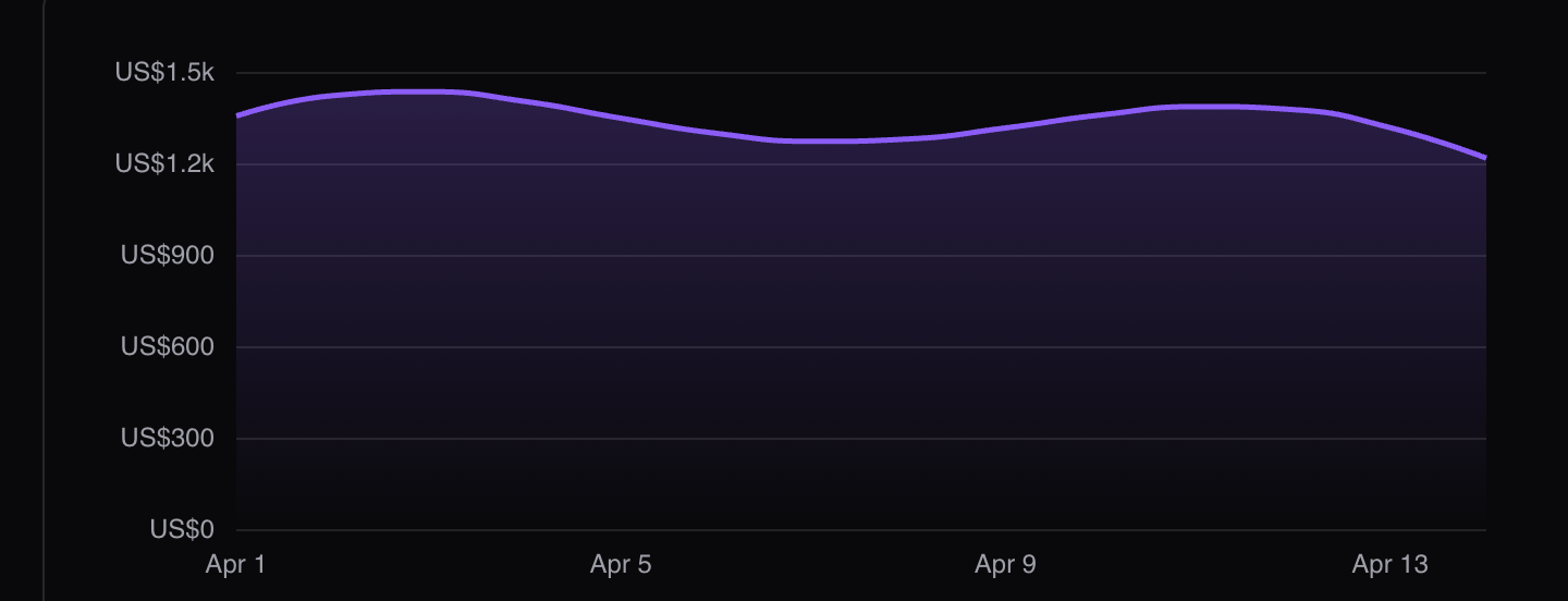
The charts release. A declarative <.chart> on Apache ECharts, plus a zero-JavaScript <.sparkline> for inline trends. Both free, both open source.
A chart is a plain Elixir map
You describe the chart as a map (the ECharts option object) and hand it to the component. No JavaScript per chart, no client data layer, no JSON endpoint to stand up: the whole spec lives server-side and travels the LiveView wire as data. Update the assign and the chart animates in place. For high-frequency streams there’s a push_event escape hatch.
It themes itself from your tokens
Colours come from your CSS custom properties at mount, the same dial as every other component. The series palette reads pc-chart-1 through pc-chart-8, falling back to your semantic ramps; axes, gridlines and tooltips come from your gray ramp. Flip dark mode and every chart re-colours itself. Named formatters like "petal:currency:USD" give you money axes and tooltips with zero JavaScript on your side.
A zero-JS sparkline
Not every trend needs a full chart. <.sparkline> renders inline trend lines as pure server-rendered SVG - no JavaScript, so it works in stat cards, table cells, even email. It inherits currentColor, so a text class sets the colour.
We ran it on our own dashboard first: the petal.build admin is built on these now. The engine is bring-your-own (like Alpine) - npm i echarts, expose it on window.echarts, and the hook finds it. Update with mix deps.update petal_components, and the charts docs have the rest.
20 July, 2026
Petal Components 4.6 - AI chat, a ⌘K palette, and theme tokens
Three releases in one update: 4.4, 4.5 and 4.6. All free and open source.
AI chat, the LiveView way
A full chat kit: streaming messages, tool calls, reasoning blocks, markdown replies, an autogrowing composer, message actions and starter chips. No client AI SDK - your model streams to your LiveView process, you push each token to the bubble, and the bubble owns its own DOM so LiveView never re-renders over the text as it lands. Tool calls render as real Phoenix components with their own phx-click and state.
A ⌘K command palette
Built on the native dialog element, so the top layer, focus trap, backdrop and Escape come from the browser for free. It escapes every overflow:hidden container, and filtering happens client-side so keystrokes never wait on the server.
Aurora and border beam, now free
Two ambient background pieces, ported over from Petal Pro and rebuilt on the way: a drifting gradient glow for heroes, and a light that traces a panel border with glow, multiple beams and a spring easing. Pure CSS, and both hold still for prefers-reduced-motion.
Theme tokens
Set --pc-radius in your CSS and every button, badge, input, select, checkbox, modal, dropdown and tooltip follows it. One custom property, whole library. No config, no theme engine - CSS variables in your stylesheet. You own it.
A forms overhaul
Every form control sits on one shared surface system, so dark mode is one material instead of a mix of grays. Calmer error states, an input_group for prefix/suffix addons, and an input_otp that is one real invisible input stretched across painted segments - which is why paste and SMS autofill just work.
Docs that can’t drift
Component examples now live inside the package as compiled HEEx blocks. The playground and petal.build render the same registry, and examples compile against the real components, so the code you copy always matches the preview.
On Petal Pro? Take Pro 4.4.0 before updating petal_components. Full details in the components docs.
29 June, 2026
Petal Components 4.2 - a big typography upgrade
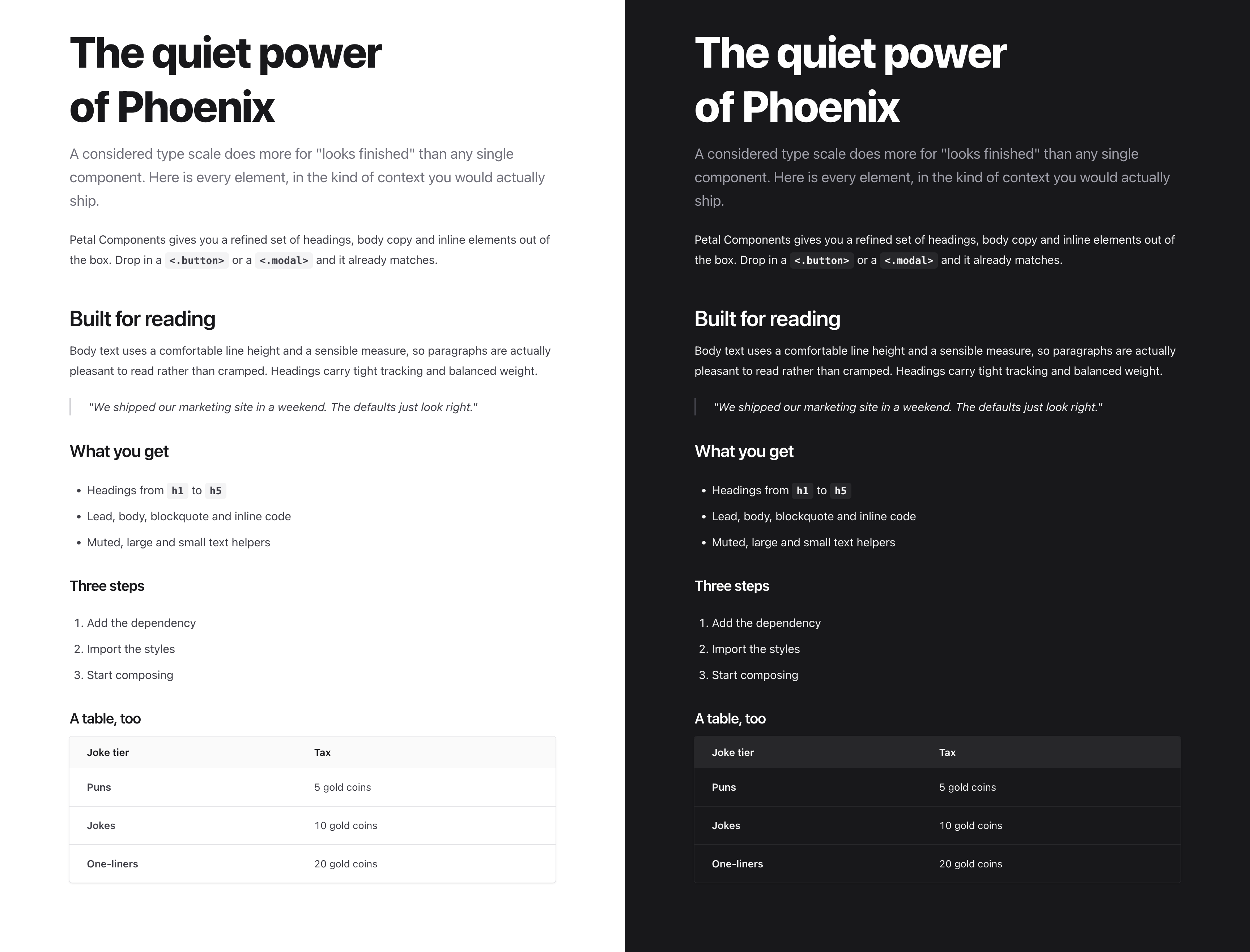
A reworked type scale and 7 new text components, so you can lay out a full page from components alone. The defaults now do the typographic work for you.
One emphasis scale
Strong, default and muted tiers that stay consistent in light and dark, so your hierarchy never collapses when the theme flips.
Spacing that means something
Headings bring their own rhythm, so a page composes with no manual margins. Body text sits at a comfortable measure built for reading.
7 new text components
lead, blockquote, inline_code, text_large, text_muted, text_small and hr. Update with mix deps.update petal_components.
See the full example.
24 June, 2026
Petal Pro 4.3 - Private file uploads, R2 and Tigris, SAML SSO
4.3 is all about file storage, with a couple of enterprise extras.
Private file uploads
Set private: true on your :s3 config and your bucket stops being public. Files are stored as object keys and served through short-lived presigned URLs instead. The upload flow you already have does not change - call download_url/1 where you display a file and it just works. It is a no-op for public buckets, so it is safe to call everywhere.
Cloudflare R2 and Fly Tigris
Point a single endpoint config line at R2, Tigris, or any S3-compatible service and uploads, downloads and deletes all run through the same path. Both ride on the existing S3 provider, so there is nothing new to learn.
Automatic avatar cleanup
When a user replaces or clears their avatar, the old file is now deleted from storage automatically. No more orphaned files piling up in your bucket.
SAML SSO recipe
A new /recipes:add-saml-sso walkthrough for wiring up enterprise identity providers like Okta, Microsoft Entra and Google Workspace, with the security prerequisites spelled out.
Read the upgrade guide and the full changelog.
21 May, 2026
Petal Pro 4.1 - Passkeys and persistent AI chat
4.1 ships two things developers have been asking for: passkey authentication and persistent AI admin chat history.
Passkeys
Users can now register passkeys (Face ID, Touch ID, hardware security keys) from their security settings. Up to 5 per user.
Two modes ship out of the box:
- Primary auth - sign in with a passkey, no password needed. A “Sign in with passkey” button appears on the login page automatically when passkeys are enabled.
- Second factor - passkey as 2FA on top of a password, mirrors the existing TOTP flow.
Passkeys are phishing-resistant by design. The credential is cryptographically bound to your domain - a fake login page can intercept a password, but it can’t intercept a passkey. Fully optional: set config :petal_pro, :passkeys_enabled, true to turn it on.
Persistent admin chat history
Admin AI chat conversations are now saved to the database and survive page reloads and server restarts. The sidebar lists recent conversations so you can pick up where you left off.
Stricter quality checks
mix quality now runs credo --strict and dialyzer alongside the existing checks. Fresh clones pass both out of the box.
4 May, 2026
Petal Pro 4.0 — AI-Ready

We’re excited to announce Petal Pro 4.0 — our biggest release since the project started. v4 repositions Petal Pro as the AI-ready Phoenix boilerplate: MCP server, Jido AI, 22 Claude Code recipes, and a full suite of new product features to ship to your users.
AI-Ready Architecture
Admin MCP server
Point Claude Code at POST /api/mcp with a bearer token and you have a working tool surface — search users, manage memberships, query stats — without leaving your editor. 10 actions ship out of the box. Adding a new one is one Jido.Action module.
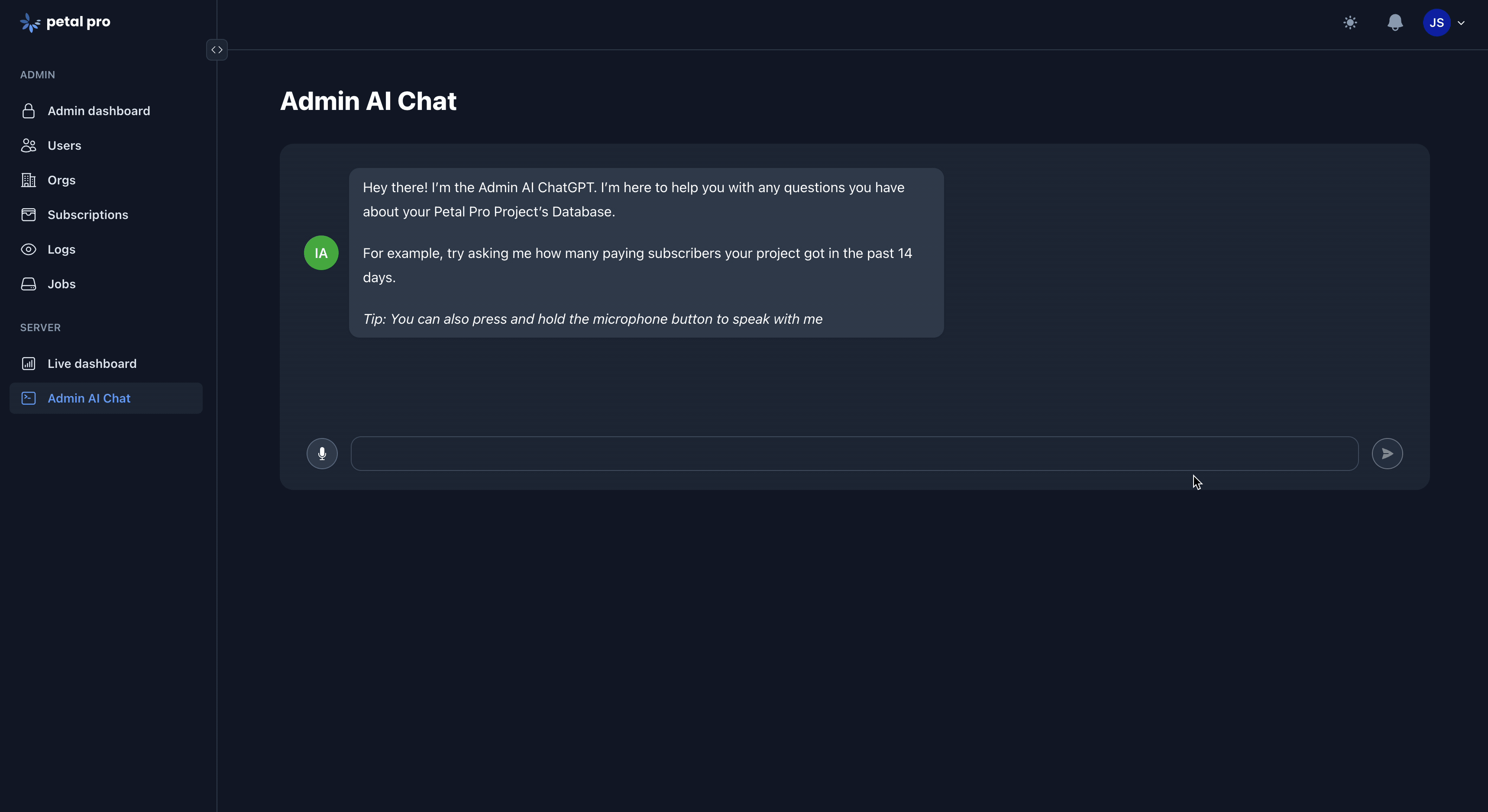
AI admin chat (native Jido)
The in-app admin chat got rebuilt on Jido.Action so it shares the same tool registry as the MCP server. Add a tool once, get it in both places. LangChain and Tesla are gone. Everything’s on Req.
AI cost tracking
Every Claude/OpenAI/Gemini call gets logged with token counts, costs, and timing in ai_call_logs. Built as a Req plugin. No wrapper code in your app.
22 Claude Code recipes
Slash commands for the customisations everyone does first: /recipes:remove-billing, /recipes:add-magic-link-auth, /recipes:switch-to-single-tenant, /recipes:remove-orgs, and 18 more. Plus 5 sub-agents (schema-architect, elixir-reviewer, heex-reviewer, ui-ux-reviewer, test-runner) and a stack of scaffolding skills to accelerate development.
New Product Features
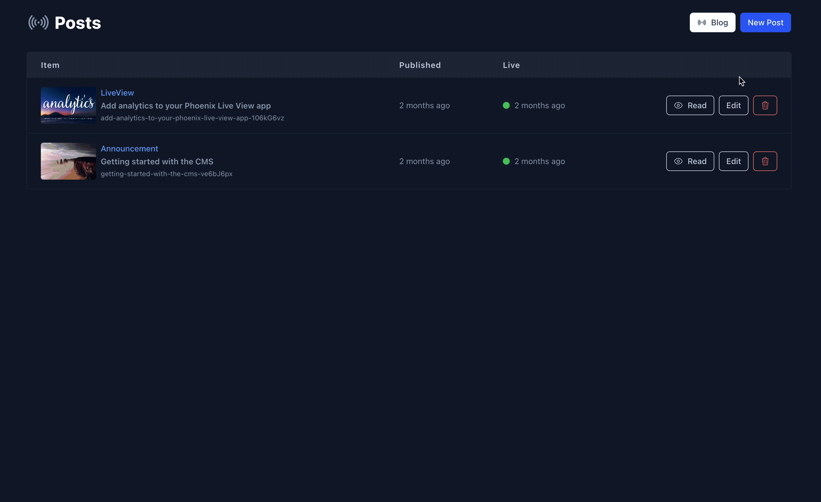
Built-in changelog system
Ship your own changelog to your users. Full admin CRUD with an Editor.js content editor, public pages with likes and social sharing, a promotional banner component, and email notifications when new entries are published.
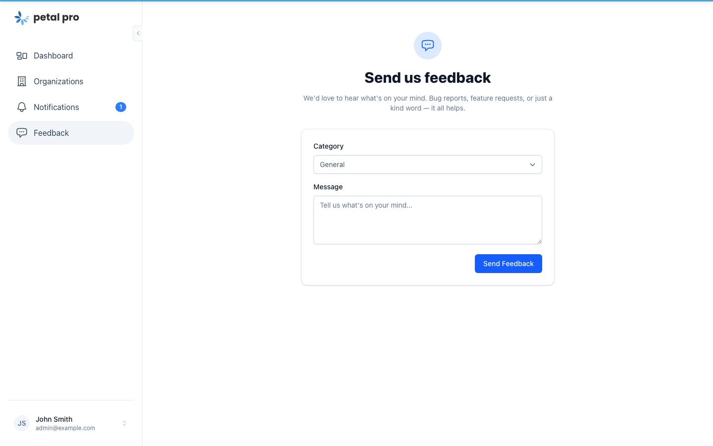
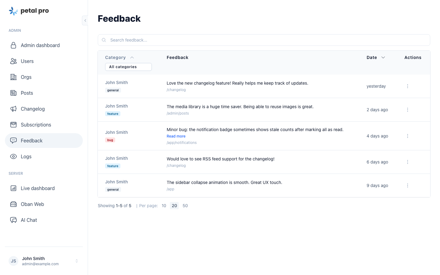
In-app feedback
A built-in feedback widget at /app/feedback lets users submit bug reports and feature requests with category tags. Includes a searchable admin dashboard — no third-party tool needed.
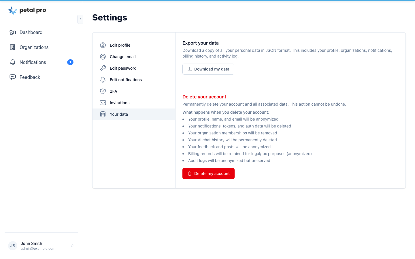
GDPR Your Data
A new /app/users/your-data page lets users export their full personal data as JSON and submit account deletion requests. Soft-delete + anonymisation cascade + Oban background processing. Feature-flagged via :gdpr_mode.
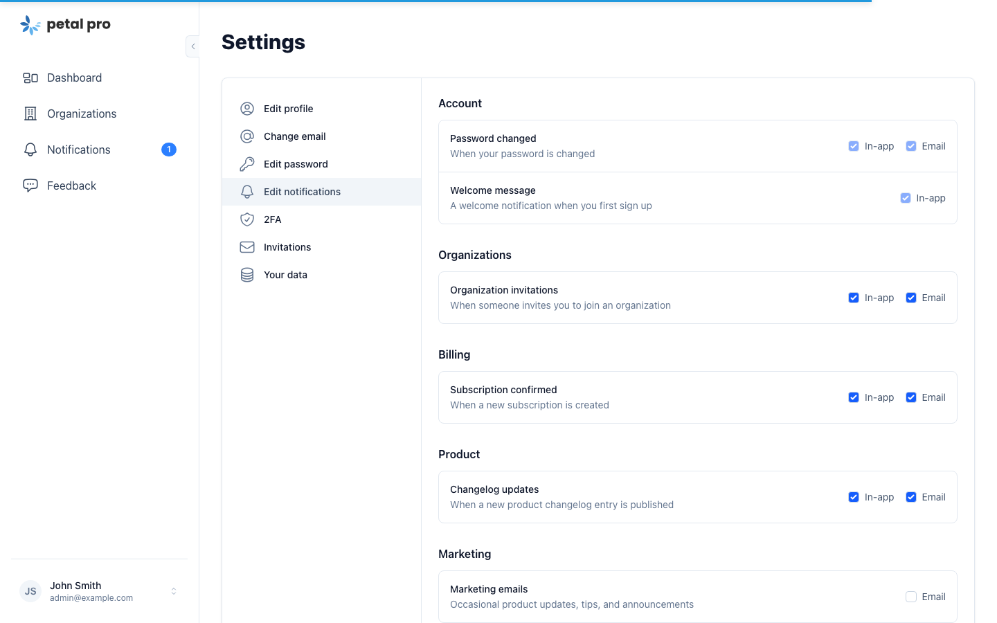
Granular notification preferences
Per-type toggles for in-app vs email. Security-critical notifications are forced-on. Single dispatch entry point: Notifications.notify/3 — checks per-user preferences, fans out to the right channels.
New sidebar layout
The app shell got a full refresh. Collapsible sidebar with localStorage persistence, mobile-friendly sticky bar, and a live notification badge. The old top-nav header is gone.
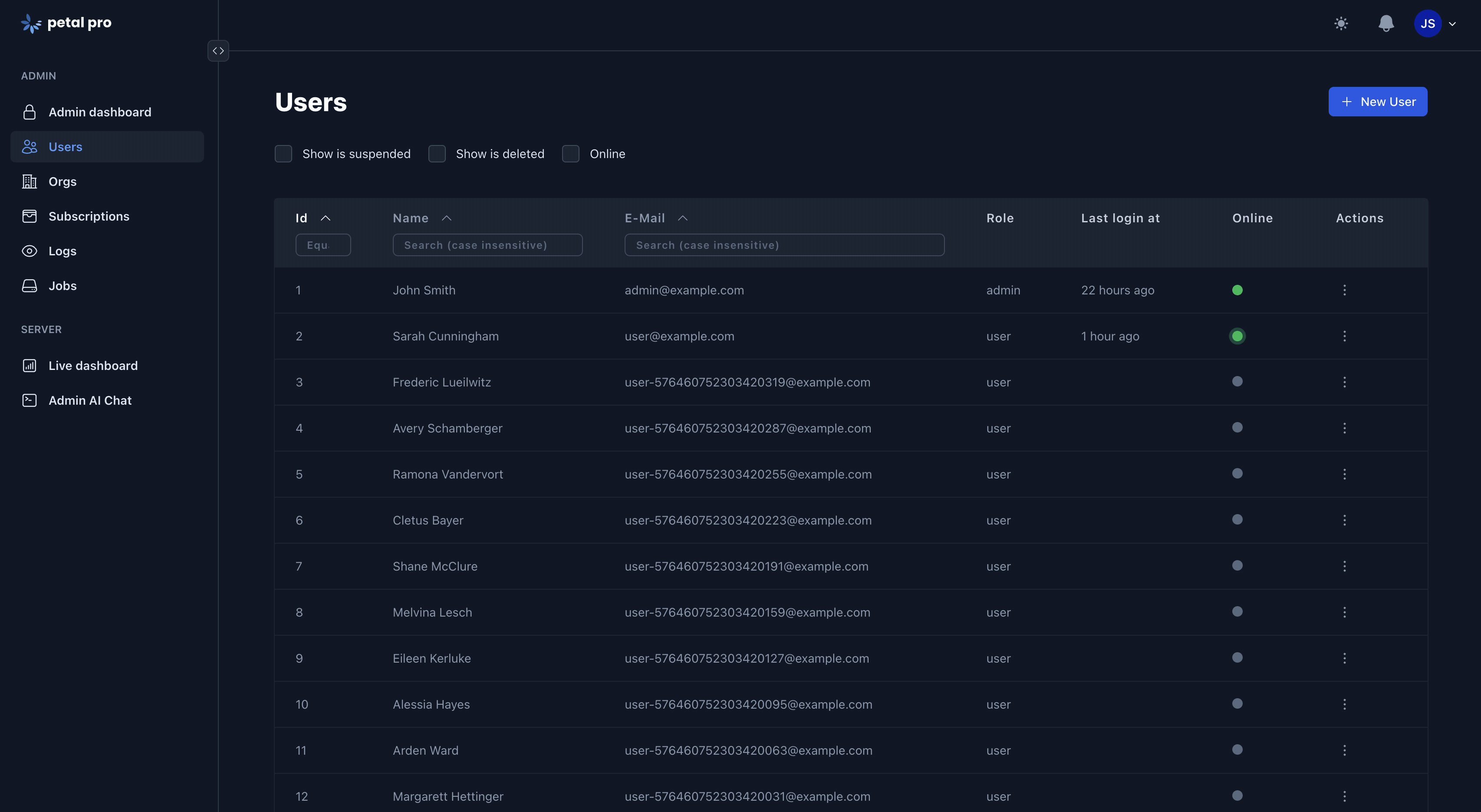
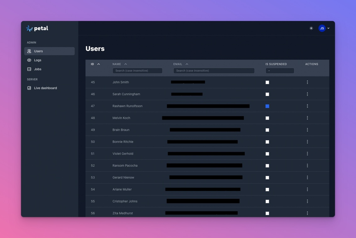
DataTable overhaul
Declarative DataTableConfig, global search, filter chips, row selection, and bulk actions via a new toolbar component.
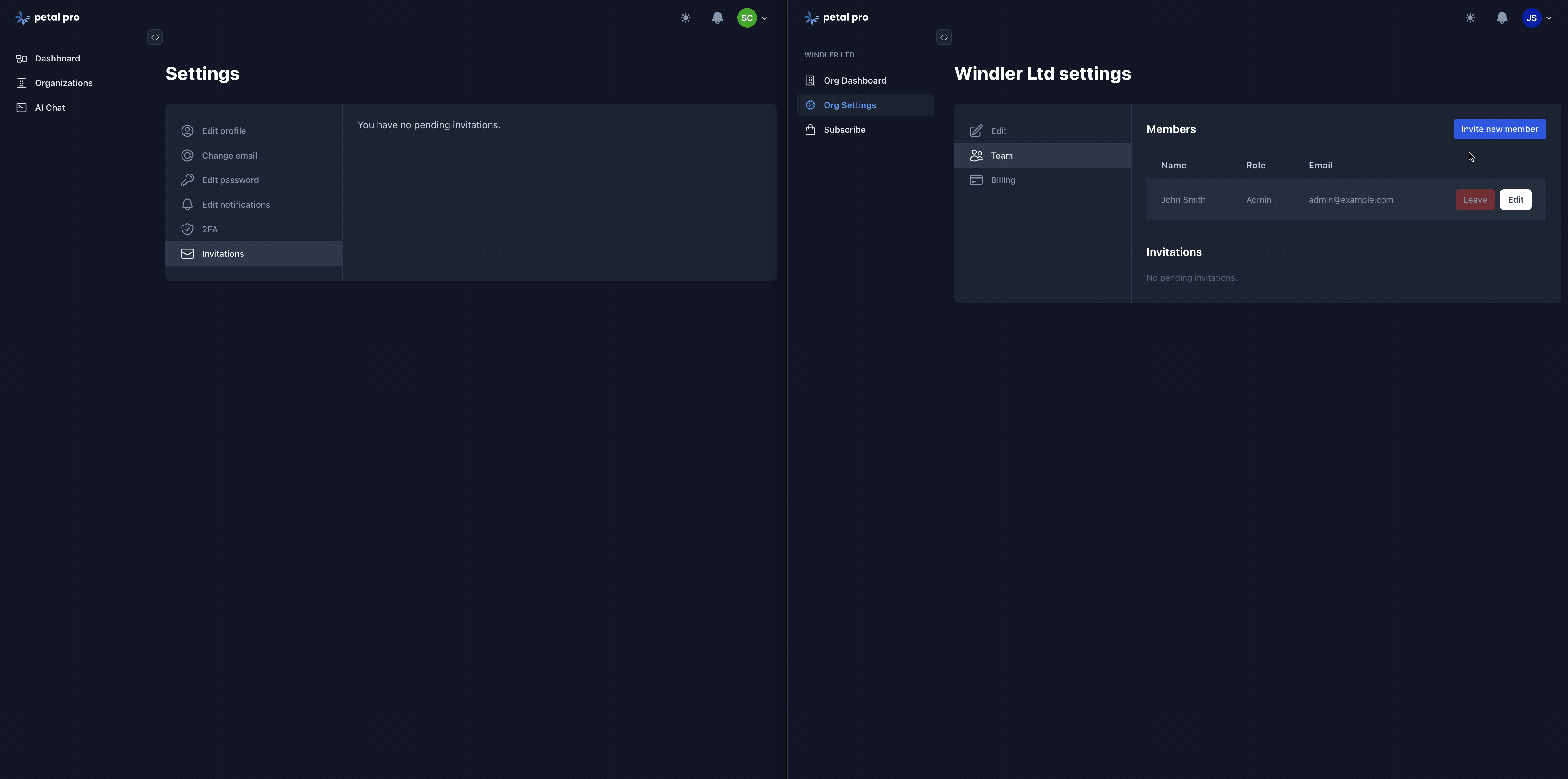
Org ownership model
New owner role (owner → admin → member), ownership transfer, self-service leave org, and invitation expiry with auto-purge.
Infrastructure
-
Sentry — set
SENTRY_DSNand error monitoring just turns on - Hammer — rate limiting on auth endpoints out of the box
- Resend — transactional email adapter (one env var)
- Bunny.net — file upload provider
-
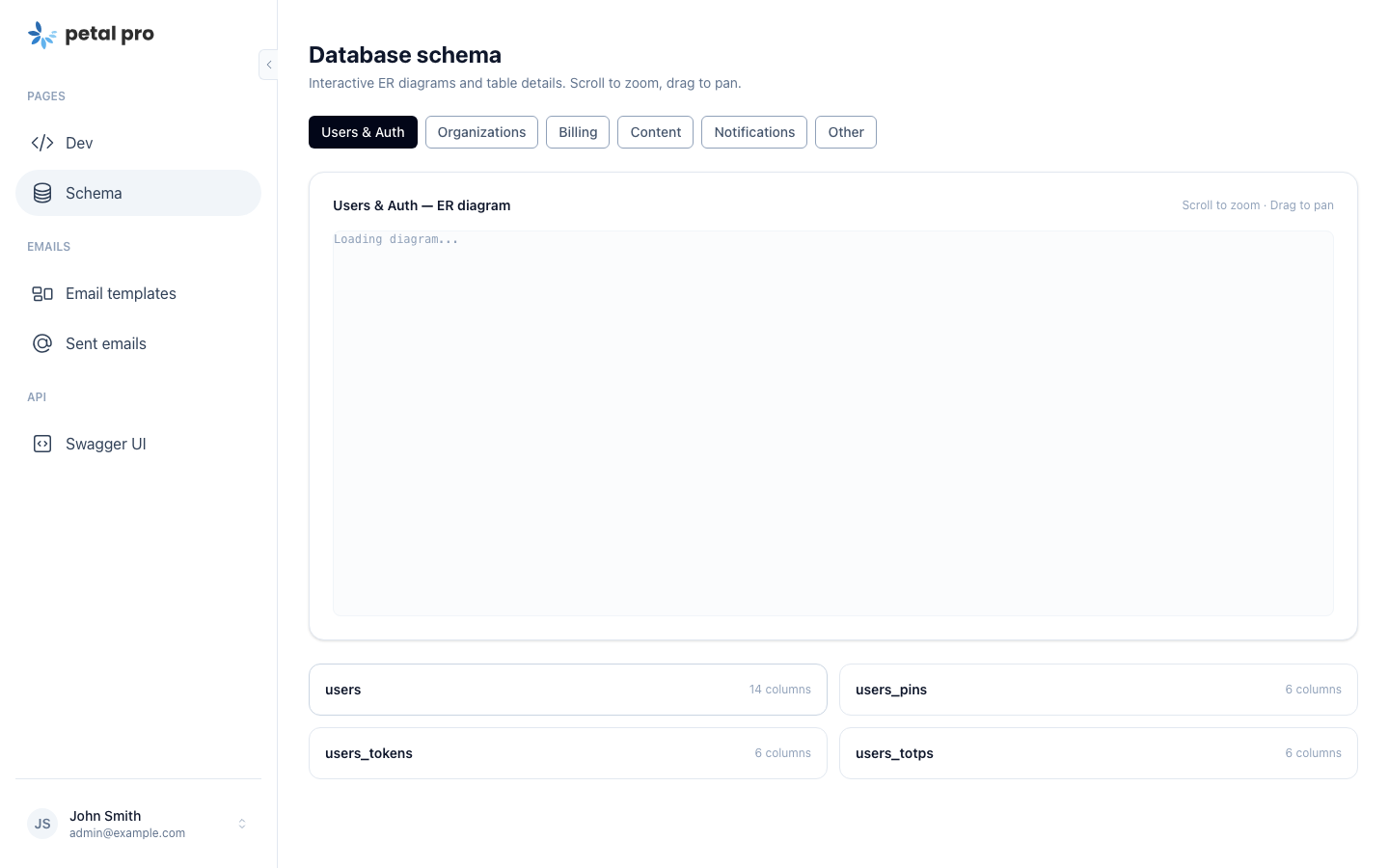
DB schema visualiser — interactive ER diagrams at
/dev
- Dynamic OG images — via ChromicPDF
- UUID v7 — across all primary keys
- Elixir 1.19+ / OTP 27
- HTTPoison/Tesla → Req — across the board
Breaking changes
- UUID v7 migration (bigint → binary_id) — see the upgrade guide
- LangChain removed, Jido AI required
- HTTPoison/Tesla removed, Req required
- Sidebar-only layout (top-nav header gone)
-
New
ownerorg role - Elixir 1.19+ minimum
6 Nov, 2025
Petal Pro upgrades to Phoenix 1.8 & LiveView 1.1 - The Future is Here!
 Currently available via our Petal Pro Github Repo (available soon for download),Wwe’re thrilled to announce that Petal Pro has been upgraded to Phoenix 1.8.1 and LiveView 1.1.17! These aren’t just version bumps - they bring significant improvements to performance, developer experience, and capabilities.
This upgrade brings:
- Phoenix 1.8.1 - Latest stable Phoenix release
- LiveView 1.1.17 - Cutting-edge real-time features
- LazyHTML - Improved HTML parsing and rendering
- Enhanced performance and stability
Phoenix 1.8 🔥
Phoenix 1.8 brings numerous improvements:
- Verified Routes - Type-safe routing with compile-time verification
- Stream Collections - Efficient handling of large datasets
- Improved Error Pages - Better debugging experience
- Enhanced WebSocket Performance - Faster real-time updates
- Better Telemetry - More insights into your application
- Modernized Generators - Up-to-date code generation
LiveView 1.1 ⚡
LiveView 1.1 introduces powerful new features:
Async Operations
Handle multiple async operations more elegantly with improved assign_async:
def mount(_params, _session, socket) do
  {:ok,
   socket
   |> assign_async(:user_stats, fn -> load_stats() end)
   |> assign_async(:notifications, fn -> load_notifications() end)}
end
Improved Streams
Better performance and API for handling large lists:
stream(socket, :posts, posts, reset: true)Enhanced Forms
Simplified form handling with better error messages and validation feedback.
Better Testing
Improved test helpers and better error messages make testing LiveViews even easier.
LazyHTML 🎯
The addition of LazyHTML improves HTML parsing and rendering performance. Benefits include:
- Faster initial page loads
- More efficient diff calculations
- Better memory usage
- Improved compatibility with modern HTML
Migration Notes 📝
We’ve ensured backwards compatibility where possible. Key changes:
- CSS Selectors: Updated to be compatible with LazyHTML parser
- Tesla Deprecation: Suppressed warnings (fix coming in next release)
- Test Suite: All tests passing with new versions
- Dependencies: Updated to compatible versions
Performance Improvements 🚀
Our benchmarks show:
- 15-20% faster initial page loads
- 30% improvement in LiveView patch times
- Reduced memory footprint
- Better WebSocket connection stability
What’s coming up?
Now that we’re on the latest stable versions of Phoenix and LiveView, we’re focusing on:
- Announcements/Changelog feature
- Enhanced AI capabilities
- Advanced analytics
- More UI components
- Performance optimizations
If you have any feature requests for an upcoming release, please create one on our roadmap.
22 Jul, 2025
Petal Pro 3.0 released with Tailwind 4, Metered Billing, Oban Web & stunning new UI components!
 We’re thrilled to announce Petal Pro 3.0 - our biggest release yet! This version brings cutting-edge features and major framework upgrades that will supercharge your SaaS applications.
This release focuses on:
- Tailwind CSS 4 - The future of utility-first CSS
- Stripe Metered Billing - Usage-based pricing for your SaaS
- Oban Web - Professional job monitoring out of the box
- New Pro Components - Aurora effect and BorderBeam for stunning UIs
- TailwindFormatter - Automatic Tailwind class sorting
Tailwind CSS 4 🎨
We’ve upgraded Petal Pro to Tailwind CSS 4, bringing significant performance improvements and new features. Tailwind 4 introduces a new engine that’s faster, more powerful, and requires less configuration.
Key benefits:
- Faster build times
- Smaller CSS output
- Modern CSS features (container queries, cascade layers)
- Enhanced gradient and color utilities
- Better dark mode support
The upgrade maintains full backwards compatibility with your existing styles while unlocking these new capabilities.
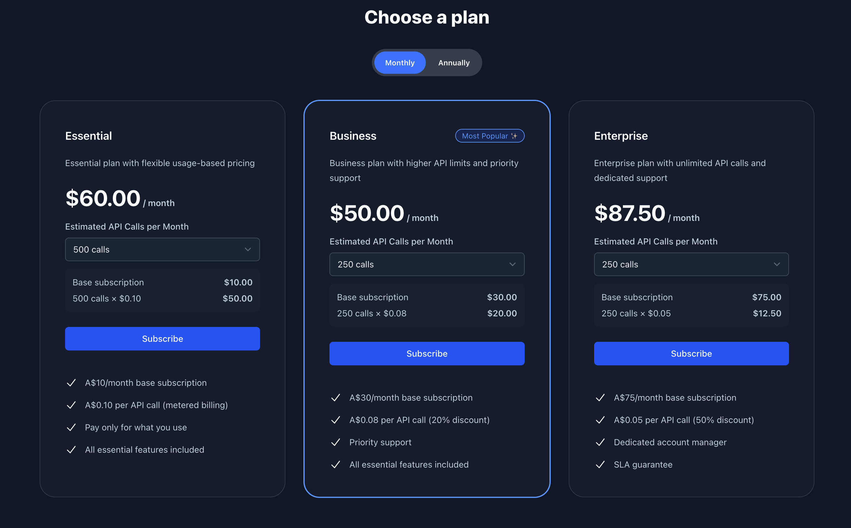
Stripe Metered Billing 💰
One of our most requested features is finally here! Petal Pro now supports usage-based billing with Stripe metered subscriptions. Perfect for SaaS applications that charge based on usage (API calls, compute hours, storage, etc.).
Features:
- Track usage events in real-time
- Automatic sync with Stripe
- View current usage and upcoming invoices
- Support for multiple meters per subscription
- Configurable unit pricing
- Background job processing with Oban
You can now offer flexible pricing models like:
- Pay-per-use (e.g., $0.10 per API call)
- Tiered pricing with usage limits
- Hybrid plans (base fee + usage)
The system includes a CollectMeterEvents GenServer that batches events and syncs them with Stripe periodically, ensuring accurate billing without overwhelming your API limits.
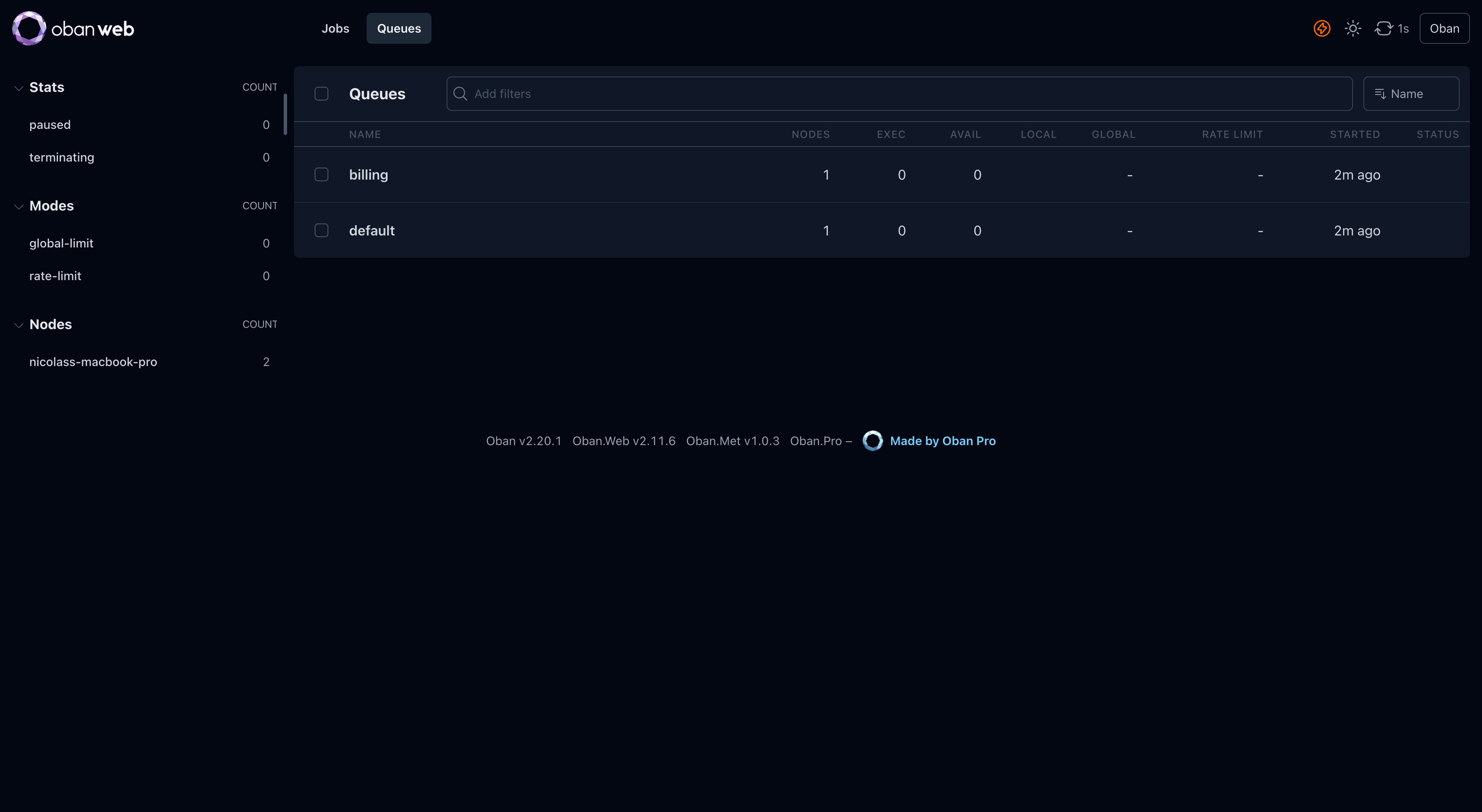
Oban Web Integration 🔧
We’ve replaced the custom Admin Jobs interface with Oban Web - the official, professionally maintained job monitoring solution. This gives you enterprise-grade job management out of the box.
What you get:
- Real-time job monitoring
- Advanced filtering and search
- Job retry and cancellation
- Queue management
- Historical insights
- Performance metrics
The integration is seamless and secured behind your admin authentication. Access it at /admin/jobs to monitor background tasks like email sending, subscription syncing, and meter usage reporting.
New Pro Components ✨
We’ve added two stunning UI components to help your app stand out:
Aurora Effect
A mesmerizing animated gradient background effect perfect for hero sections, authentication pages, and landing pages. The aurora creates a subtle, professional ambiance that draws attention without being distracting.
BorderBeam
An animated border effect that adds movement and visual interest to cards, buttons, and containers. Great for highlighting CTAs, featured content, or premium features.
Both components are:
- Fully responsive
- Dark mode compatible
- Performance optimized
- Easily customizable
You can see BorderBeam in action on the new authentication layout!
TailwindFormatter 🎯
Say goodbye to messy Tailwind classes! We’ve integrated TailwindFormatter which automatically sorts your Tailwind classes according to the recommended order.
Before:
<div class="mt-4 text-gray-900 bg-white dark:bg-gray-800 flex p-4 rounded-lg">After:
<div class="flex rounded-lg bg-white p-4 mt-4 text-gray-900 dark:bg-gray-800">Classes are sorted intelligently: layout → display → sizing → spacing → colors → effects. This improves code readability and makes it easier to spot duplicates or conflicts.
Other Improvements 🚀
- Fixed: Subscription checkout now properly redirects and displays Stripe errors
- Fixed: Authenticated views no longer auto-subscribe to user notifications (performance improvement)
- Fixed: Combobox maintains selections when navigating between pages
- Fixed: Seeder properly clears posts and files before regenerating
- Updated: Test environment port is now configurable
- Updated: Post and File schemas now properly extend PetalPro.Schema
What’s coming up?
- Phoenix 1.8 & LiveView 1.1 upgrade
- Announcements/Changelog feature
- Enhanced notification system
- More AI integrations
If you have any feature requests for an upcoming release, please create one on our roadmap.
19 Dec, 2024
Petal Pro 2.2 released with Content Editor, Blog/CMS, and LiveView 1.0!
 Exciting news! Petal Pro 2.2 brings powerful content management capabilities and the latest LiveView stable release. This version is all about helping you create rich, engaging content.
Key features in this release:
- Content Editor powered by Editor.js
- Full-featured Blog/CMS system
- LiveView 1.0.1 stable release
- Enhanced gettext support
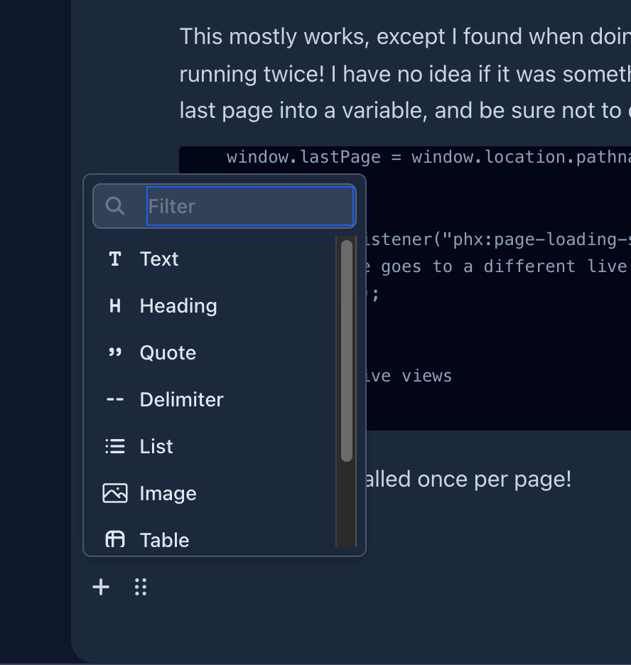
Content Editor Component 📝
We’ve integrated Editor.js to bring you a modern, block-based content editor. This isn’t just another WYSIWYG - it’s a powerful, extensible editor that makes content creation a joy.
Features:
- Block-based editing - Each piece of content is a separate block (paragraph, heading, image, code, etc.)
- Rich media support - Images, videos, embeds, tables, quotes, and more
- Code blocks with syntax highlighting
- Clean JSON output - Easy to store and render
- Extensible - Add custom blocks as needed
- Mobile-friendly - Works beautifully on all devices
- Dark mode compatible
Supported blocks:
- Headers (H1-H6)
- Paragraphs
- Lists (ordered and unordered)
- Quotes
- Code blocks
- Tables
- Images (with captions)
- Embeds (YouTube, Twitter, etc.)
- Warnings/Alerts
- Delimiters
- Inline formatting (bold, italic, code, marker)
The component integrates seamlessly with LiveView and includes server-side rendering with beautiful Tailwind Typography styling.
Blog/CMS System 🌐
Building on the Content Editor, we’ve created a complete blog and content management system. Perfect for:
- Company blogs
- Documentation sites
- Knowledge bases
- News sections
- Help centers
Features:
- Draft and publish workflow - Work on posts privately before publishing
- Rich content editing - Use the Content Editor for beautiful posts
- SEO-friendly - Custom slugs, meta descriptions, and Open Graph tags
- Categories and tags - Organize your content
- Author attribution - Track who created each post
- Scheduling - Publish posts at specific times
- Public and authenticated views - Control who can see what
- Responsive design - Looks great on all devices
- Dark mode support
Admin features:
- DataTable with sorting and filtering
- Bulk actions
- Preview before publishing
- Analytics (view counts, published dates)
- Easy navigation between drafts and published posts
The CMS is ready to use out of the box but flexible enough to customize to your needs. Use it for a traditional blog, documentation site, or adapt it for your specific content requirements.
LiveView 1.0.1 🚀
We’ve upgraded to LiveView 1.0.1 - the first stable release of Phoenix LiveView! This brings:
- Improved stability and performance
- Better error messages
- Enhanced form handling
- Async operations improvements
- Bug fixes and optimizations
LiveView 1.0 represents years of production hardening and is ready for the most demanding applications.
Enhanced Gettext Support 🌍
We’ve updated our gettext implementation to use the latest patterns and avoid deprecation warnings. This ensures your internationalized applications stay up-to-date with Phoenix best practices.
Bug Fixes 🐛
- Fixed: Stacked layout sub-menu now displays properly in mobile mode
- Fixed: Seeder properly handles file cleanup
- Fixed: Mobile menu no longer bleeds outside viewport
What’s coming up?
- Tailwind 4 upgrade
- Stripe metered billing
- Advanced notification features
- AI enhancements
If you have any feature requests for an upcoming release, please create one on our roadmap.
9 Oct, 2024
Petal Components v2 - a11y support, button group, skeleton & more!
 Big news! Petal Components v2 is now available - we’ve actually sped ahead and are at v2.2.0 already 🔥
…and the best news is that we’ve put a11y (accessibility) at the forefront! 🎉
Read on for more information about our a11y implementation and some other major improvements we’ve made over the last few months.
a11y support
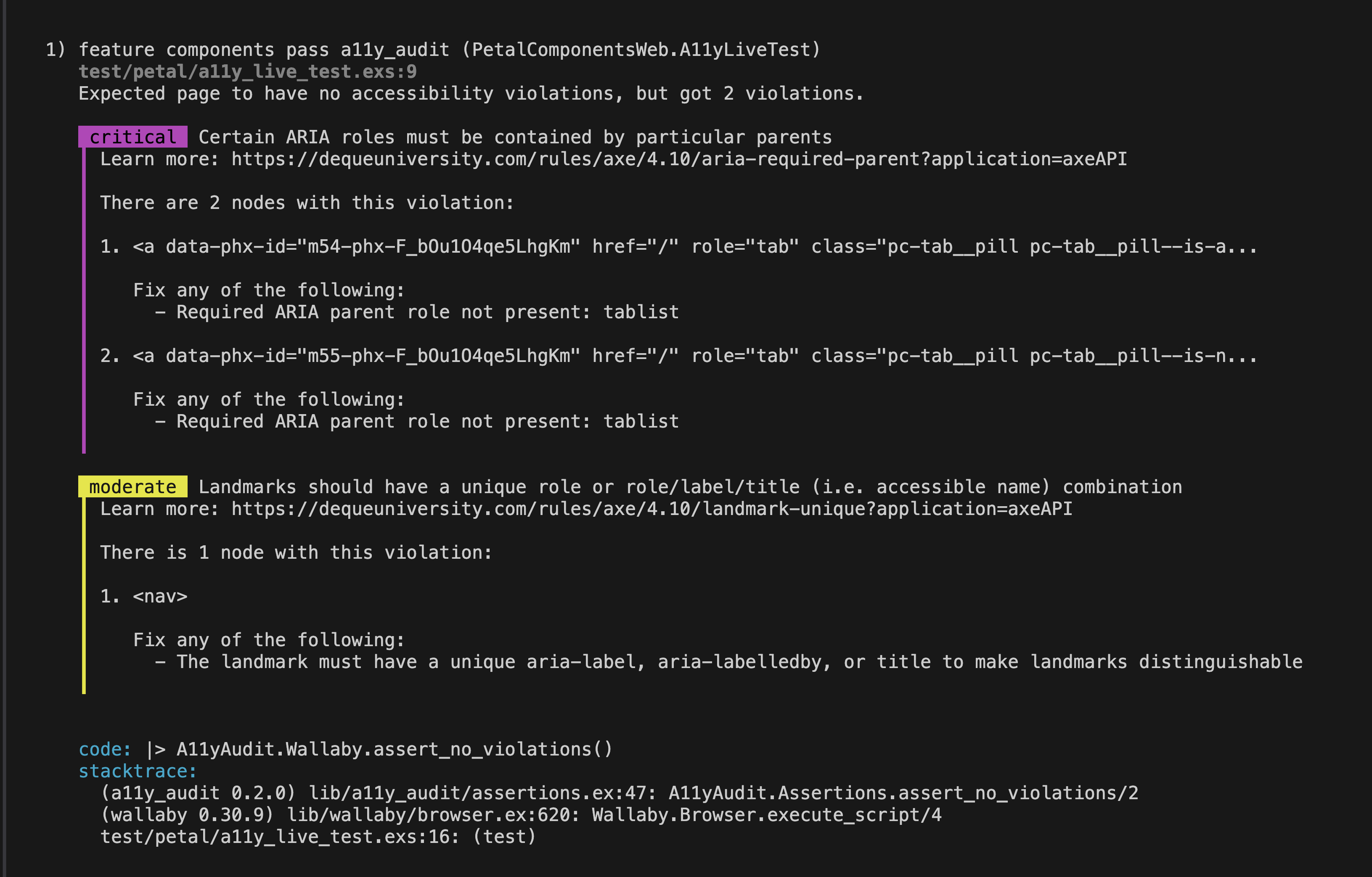
We’ve implemented a test to load a LiveView using all Petal Components and perform an accessibility audit with :a11y_audit.
:a11y_audit uses axe-core under the hood - https://www.deque.com/axe
The image above shows an instance where you have a violation. We’re happy to say that we’re now passing with flying colours!
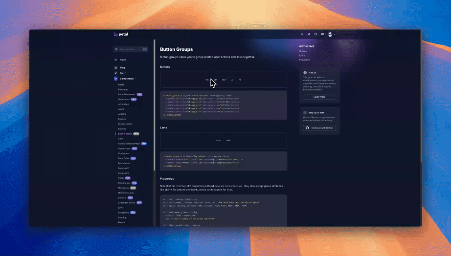
Button Group
This is one we’ve been looking to tick off for a while and glad we could finally get around to do it. We hope you find it useful and appreciate any feedback you may have.
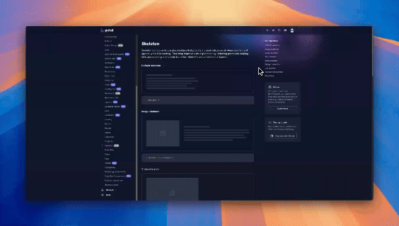
Skeleton
Skeletons are placeholders that provide a visual indication of where content will appear while it is loading. They help improve user experience by reducing perceived loading time and creating a smoother transition when the actual content is loaded.
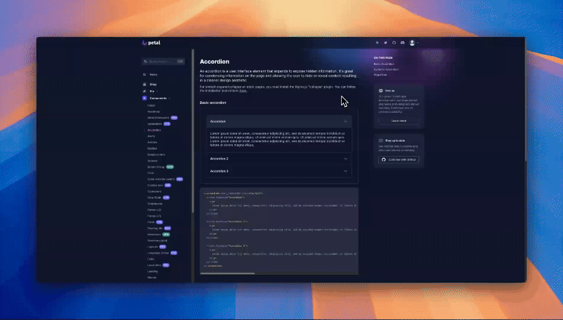
Accordion
We have now updated accordion so that you can set a particular item to be open at render.
Component Requests
If you have any component requests, please create an issue on the Petal Components roadmap.
11 Sep, 2024
Petal Pro 2.0 released with Admin Dashboard, Persistent Notifications, AI-powered Chatbot and more
 This version we’ve focused on a few major features and key innovations:
- Admin Dashboard - utilising chart.js, we’ve added a dashboard to give you a snapshot of your app’s performance.
- Persistent Notifications Mangement - a persistent notifications management system that allows you to create and manage notifications for your users.
- AI-powered Chatbot - Utilising langchain, Petal Pro includes an AI-powered chatbot that can be customized to your needs.
- See current users - shows active users to Admins by using Phoenix Presence.
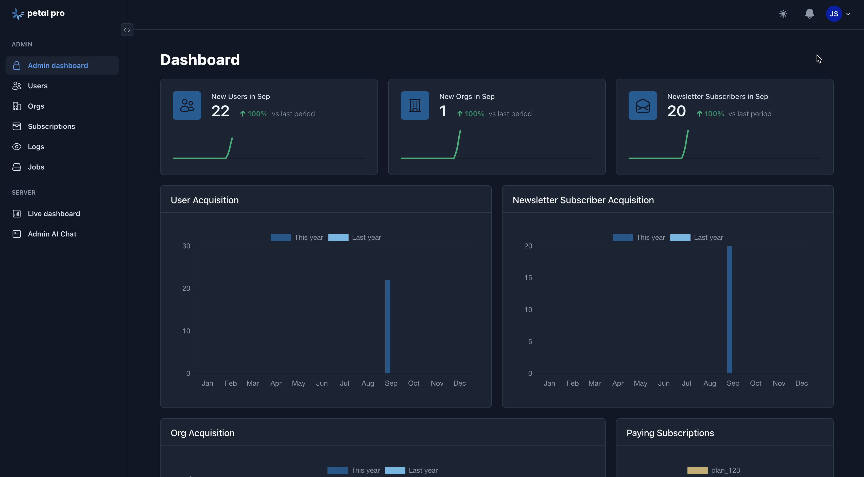
Admin Dashboard
Admins often prefer KPIs in a visual format, so we created a dashboard using LiveView and components to display stats. By integrating Chart.js, the dashboard offers a clear snapshot of your app’s performance, featuring charts and graphs for recent users, organizations, subscribers, and more.
You can check out the demo here.
Persistent Notifications Mangement
A persistent notifications management system that allows you to create and manage notifications for your users. It enables real-time updates and reminders about important events or required actions. We’ve laid the foundation so that you can inform users about critical updates or pending actions to take, which will ensure that your users stay engaged and informed.
AI-powered Chatbot
Utilizing langchain, we’ve developed a highly customizable AI-powered chatbot tailored to your specific needs. This chatbot can interact with your database, allowing you to fetch real-time information such as the most recent users, recent subscriptions, or the status of active subscriptions.
You can check out the demo here.
See current users
Using Phoenix Presence, you can see who is currently online.
What’s coming up?
- Basic CMS supporting markdown
- Announcements / Changelog
- Physical MFA like yubikey via webauthn, or passkey
- Feature Request functionality
- New AI improvements/features
If you have any feature requests for an upcoming release, please create one on our roadmap.
May 20, 2024
Official Petal Figma UI kit released 🎉
 We’ve released an official Figma UI kit for Petal. This kit includes all the open source and pro components you need to design your app in Figma.
Apr 9, 2024
Petal Pro 1.8 released with JSON API, Collapsible Sidebar, Expanded User & Org Admin
 This version we’ve focused on a few key features, fixes and updates:
- JSON API
- Update: Can sync all Stripe subscriptions including cancelled ones
- Added expanded user and org admin pages
- Fixed: PetalProWeb.Controllers.UserAuth.disconnect_user_liveviews doesn’t disconnect the user’s live views
- Fixed: Passwordless sign in issue from latest Phoenix Live View fixed
- Update: Sidebar layout now collapsible
JSON API
You can use the Petal Pro API for user management (register, sign in and update). It comes with OpenAPI support out of the box. Includes Swagger UI.
You can read more about it here.
Collapsible sidebar
We’ve modified the sidebar so that you can pull out or tuck it away so that your visitors can zero in on what they’re really there for, without the menu getting in the way.
Expanded user and org admin pages
We’ve added user and org admin pages to make things easier to manage and maintain from behind the scenes.
What’s coming up?
We’ll be powering forward with the user requested features in the roadmap.
- Admin dashboard with graphs/stats
- Persistent Notifications Management
If you have any feature requests for an upcoming release, please create one on our roadmap.
Jan 30, 2024
Petal Pro 1.7 released with Stripe Billing support
 This version we’ve focused on a few key features and enhancements:
- Stripe integration - can buy subscriptions and manage them - support for both individuals and orgs
-
Use
stylerfor code formatting - Redesigned landing page components for a more modern look and feel
Stripe integration
This is the big one. “Finally!” (Some of you say) …and we don’t blame you either. Stripe was a big piece, that for a long time, we were unsure of how to implement to our standards. We wanted it to be robust, but remain flexible and also have the ability to add other payment provider methods later on (e.g Paddle), should we go in that direction.
You can check out the demo here.

Redesigned landing page
While the previous Petal Pro landing page was a great starting point, we felt like it didn’t quite live up to our expectations of a streamlined, slick and modern looking page.
We took influence from some of the best landing pages out there and this is our attempt at something that is consistent with the previous gen, but adds some flare and hopefully gives you something that will impress your customers and clients.
What’s coming up?
With Petal Framework converted to a package, we think we have a good structure to really power forward with the user requested features in the roadmap.
- JSON API
- Admin dashboard with graphs/stats
- Augment user and orgs admin with more functionality
If you have any feature requests for an upcoming release, please create one on our roadmap.
Sep 25, 2023
Vertical Menu
Vertical Menu is super useful for main layout sidebar’s and supports nested menu items, grouped menu items and live patching!
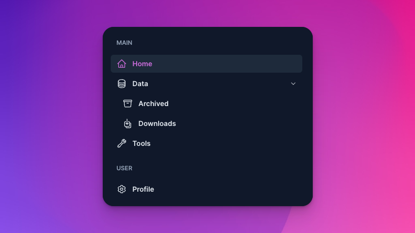
<div class="w-96">
  <.vertical_menu
    title="Main menu"
    current_page={:home}
    menu_items={[
      %{
        name: :home,
        label: "Home",
        path: ~p"/",
        icon: :home
      },
      %{
        name: :data,
        label: "Data",
        path: ~p"/",
        icon: :circle_stack,
        menu_items: [
          %{
            name: :data,
            label: "Archived",
            path: ~p"/",
            icon: :archive_box
          },
          %{
            name: :data,
            label: "Downloads",
            path: ~p"/",
            icon: :arrow_down_on_square_stack
          },
        ]
      },
      %{
        name: :tools,
        label: "Tools",
        path: ~p"/",
        icon: :wrench
      },
    ]}
  />
</div>Jul 16, 2023
Required field asterisks
Fields with the required attr set to true will now show an asterisk.
<.field type="text" required ... />
<.field type="select" ... />

Jul 04, 2023
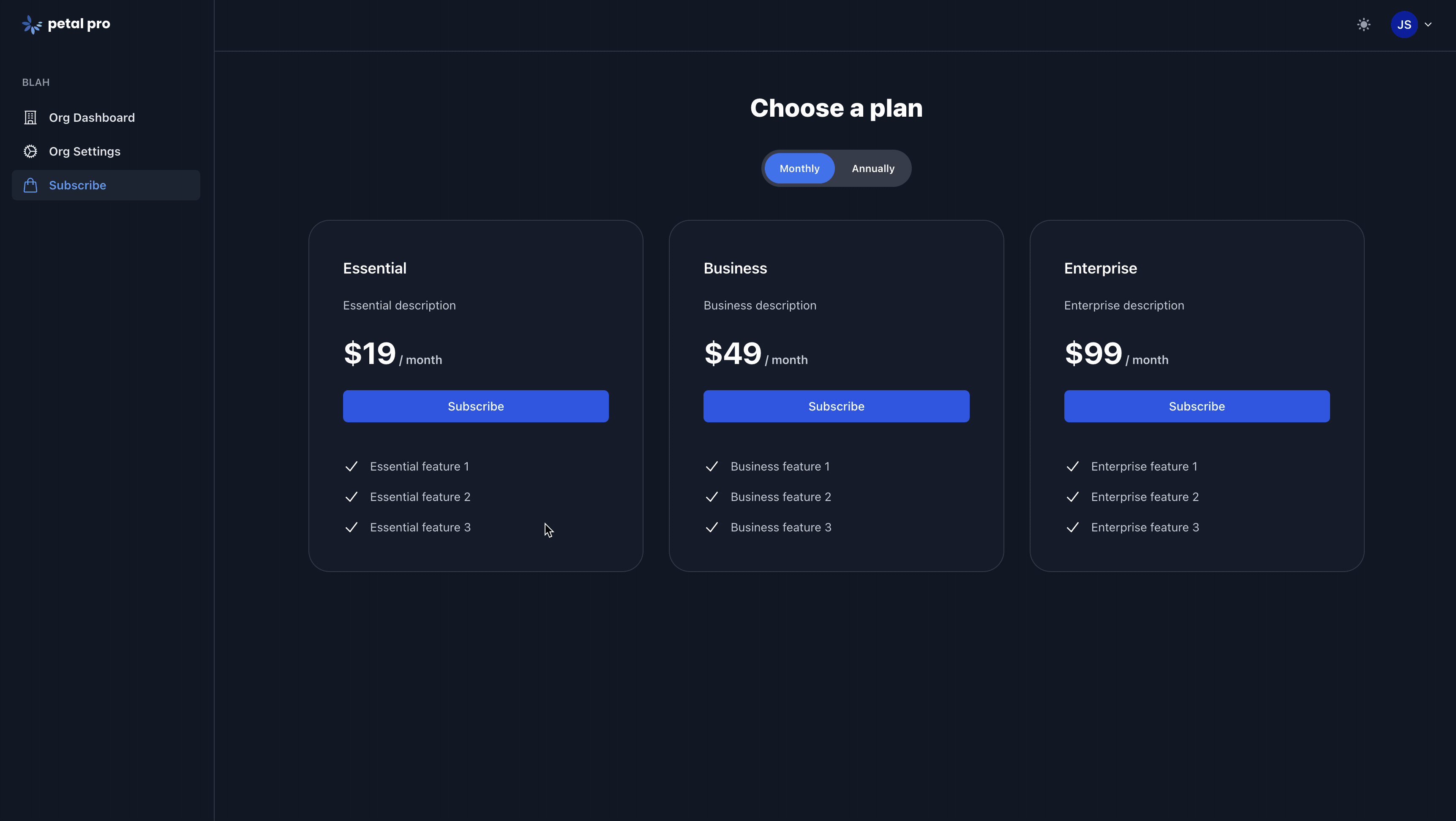
Petal Pro 1.6.0 relase 🎉
This version we’ve focused on a few key features:
- <.image_upload> component for uploading single images like avatars. Used in user settings
- Local, Cloudinary and S3 support for <.image_upload>
- User Impersonation

<.image_upload> component
You can now implement user avatars and store them locally or on S3/Cloudinary (cloudinary.com). We recommend using Cloudinary as your storage service as it allows you to resize/modify images simply by altering the URL. This means you don’t need to use a tool like ImageMagick to resize/crop/compress your images

User impersonation
Admins can login as any user without knowing their password - available via the Admin console (under the User menu).
What’s changed?
- All forms now use the new FormField structure
- <.public_layout> has been moved into public.html.heex (it’s likely you’ll want to modify this to your brand and hence a component doesn’t make sense)
What’s fixed?
- Reset password page now accessible when logged in (previously would redirect)
For a quick overview on upgrading from a previous version, please refer to this guide.
What’s coming up?
- Stripe membership functionality
- JSON API
- Admin dashboard with graphs/stats
- Feature Requests
If you have any feature requests for an upcoming release, please create one on our roadmap.
Jul 04, 2023
Added <.image_upload> component to Petal Pro
You can now implement user avatars and store them locally or on S3/Cloudinary (cloudinary.com). We recommend using Cloudinary as your storage service as it allows you to resize/modify images simply by altering the URL. This means you don’t need to use a tool like ImageMagick to resize/crop/compress your images.
Jul 04, 2023
Added User Impersonation to Petal Pro
Admins can login as any user without knowing their password - available via the Admin console (under the User menu).
May 30, 2023
Added a new button color
The Light color is unique in that it is designed to subtly adapt to dark mode.
<.button color="light" label="Light" />

May 21, 2023
Added a tooltip hook
Added docs for the Petal Framework tooltip solution. This uses Tippy.js via a hook.
<.button
  label="Has tooltip"
  data-tippy-content="Here is the tooltip"
  phx-hook="TippyHook"
  id="button_tooltip_example"
/>

May 9, 2023
Combobox
A dynamic, stylish and feature-rich combo-box as a HEEX component..
<.form for={@form} phx-submit="on_submit">
  <.combo_box
    label="Pick your favourite fruit"
    multiple
    create
    placeholder="Select an option.."
    options={["Apple", "Banana", "Orange", "Pineapple", "Strawberry"]}
    field={@form[:favourite_fruit]}
    help_text="Or add your own!"
  />
</.form>

May 4, 2023
Forms V2
In Phoenix 1.7, forms were given a new data structure to optimize live view forms. We created a new <.field> component that uses this new structure.
<.form for={@form} phx-submit="on_submit">
  <.field field={@form[:title]} />

  <.field
    field={@form[:state]}
    type="select"
    options={[{"Draft", "draft"}, {"Published", "published"}]}
  />

  <.button type="submit" label="Submit" />
</.form>April 22, 2023
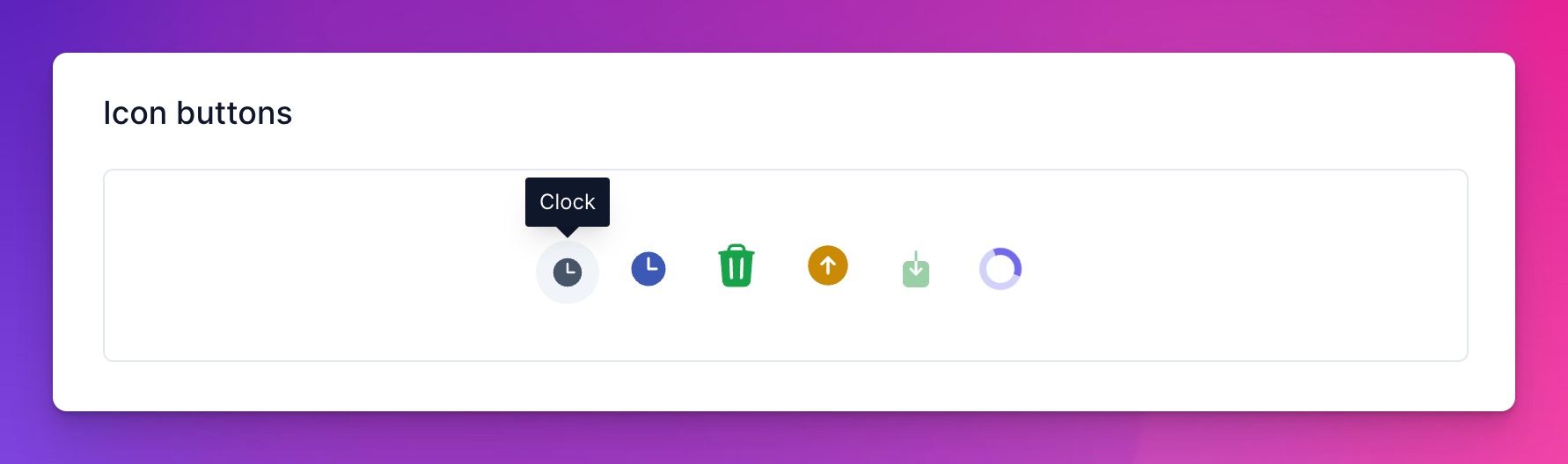
Added a tooltip option to IconButton
We’ve added a new option to the <.icon_button> component to allow you to add a tooltip.
<.icon_button tooltip="Clock" size="xs">
  <.icon name="hero-clock-solid" />
</.icon_button>
April 21, 2023
Petal Pro 1.5.2 relase & Petal Framework is born
Petal Pro v1.5.2 has just dropped 🎉. This version we’ve focused on migrating common components and functionality into a separate library called “Petal Framework”.

This will mean no more _petal_framework folders all over the place. It also means if we modify a component, you can pull in the changes easily.
It is a private package so you will need to set up your local hex to know where to find our private package. Check out the install guide for the command (it has your unique license key in it).
What’s changed in 1.5.2?
-
Uses the
petal_frameworkprivate package (deletes all the_petal_frameworkfolders). This will allow for an easier upgrade - process in the future, especially for components like the data table. -
Data Table supports
base_url_params. Keep custom query params when changing sort order. - Data Table is now self contained in the live view - code isn’t scattered across the model and context.
-
Added
mix recodefor code linting and refactoring -
Use
<.flash_group>to show flash messages (Petal Framework 0.3.0) -
Enabled Wallaby tests by default (
mix test) - Updated Tailwind to 3.3
- Updated Erlang to 25.3
-
Added
rename_projectlib to replace custom mix task - Data table API has changed slightly. See our docs https://petal.build/components/data-table on how to use
- Fixed Data table going blank when changing page size
-
Fixed Navigation problems for the Data Table when setting the
default_limitvia a schema file - Fixed Finch issue with email sending
How to buy
If you’re not a member already, you can purchase it here.
Prices: $299 USD for a single project $749 USD for unlimited projects $1999 USD for a team (unlimited projects) This gets you a years worth of upgrades. We subscribe you by default, but you can opt out at any time and keep your years worth of updates.
If you buy it and realise it isn’t for you, you can reach out to us for a refund within 7 days of purchase.
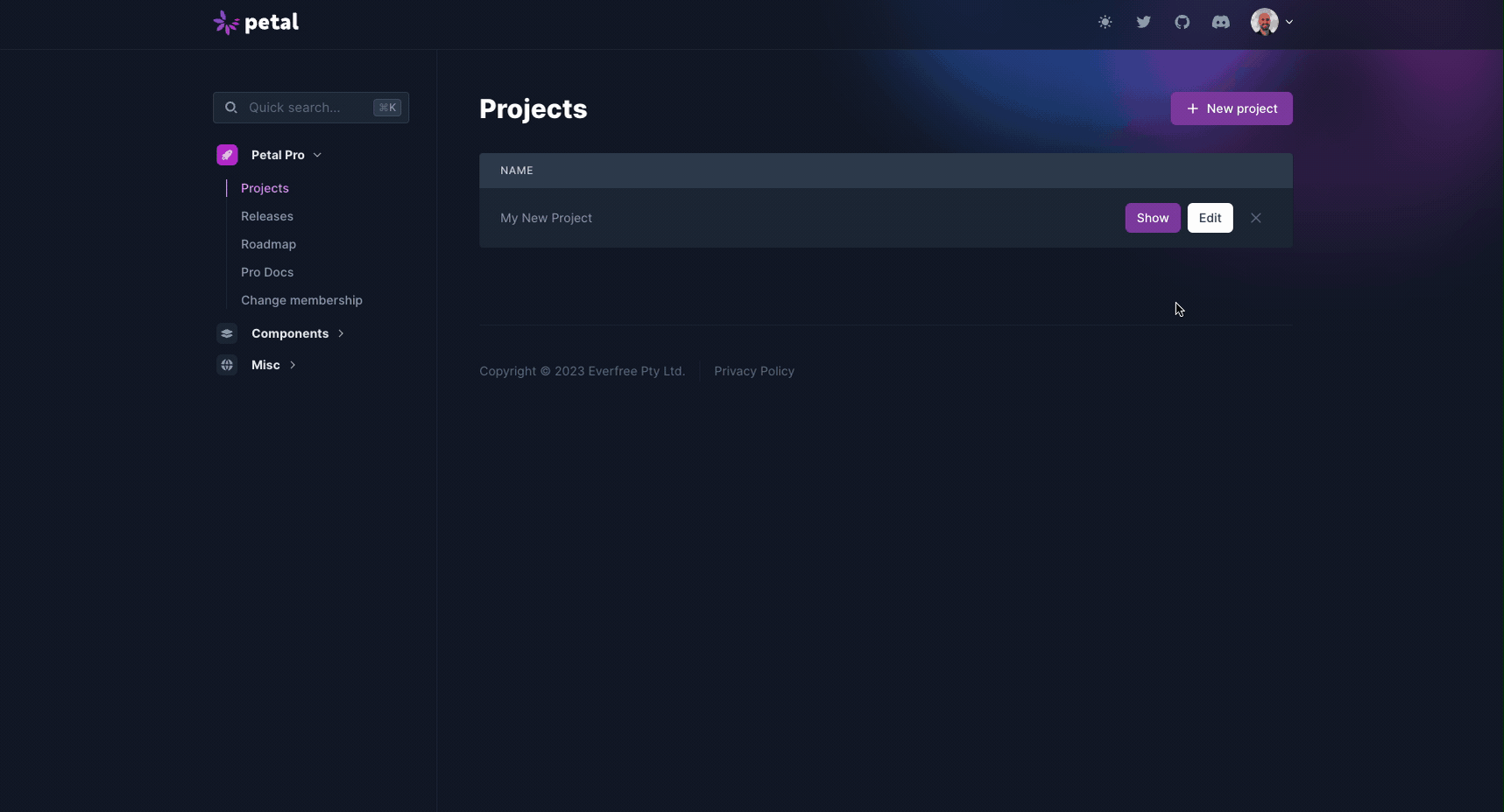
How to download
- Edit your project to be the latest Petal Pro version
- Click “Show” and you’ll see the download button.
February, 2023
Petal Components v1.0 is now available 🔥
…and the best news is that it now supports configurability! Hooray 🎉
Watch the demo video on this link or click the image below to see just how easy it is to change styles.
Can’t wait to see what cool new styles you come up with and be sure to share them with us!

Links 🔗
Petal Boilerplate project
https://github.com/PetalFramework/petal_boilerplate
Petal Components docs:
https://petal.build/components
Referencing styles:
https://github.com/PetalFramework/petal_components/blob/main/assets/default.css
VScode Snippets
Extension:
https://marketplace.visualstudio.com/items?itemName=PetalFramework.vscode-petal-components-snippets
Cheatsheet:
https://petal.build/components/snippets
Component Requests
If you have any component requests, please create an issue on the Petal Components github repo.
Contributing
If you’d like to help out we’ve got a Phoenix umbrella app that allows you to easily contribute to Petal Components (which is installed as a git submodule). If you create a new component then feel free to submit a PR. Ideally one from the roadmap but we’re open to any new components that would benefit others!
February, 2023
Petal Pro 1.5 with Phoenix 1.7 released
To download the new version you’ll need to create a new project or upgrade your existing project like in the gif below.
The big upgrade with 1.5.0 is the implementation of Phoenix 1.7 which has a number of distinct advantages you can read more about here.
How to download
We have a new layout - we hope you like it! We spent a lot of time fussing over it and have streamlined the experience to hopefully make it easier to manage projects and upgrades to new versions.
In the projects section under Petal Pro in the side menu, you’ll need to create a new project (if you haven’t already) or edit your existing project.
If creating a new project, it should automatically select 1.5.0 as the newest version, but to update your project from a previous version to 1.5.0, you’ll need to click Edit and change the version number from 1.x.x to 1.5.0 and hit save. Now you should be able to download 1.5.0.
What’s changed?
- Upgraded Phoenix to 1.7
- Routes use the new verified routes
- Authentication pages converted to live views
- Upgraded fully from Hericons v1 to v2
- petal.gen.live now uses the Data Table component
- Tesla now uses the more secure Finch over Hackney
- Confirmation page will redirect to org invitations if invitation exists
- Removed Petal Enhance (it was more complex than we thought). We will write a separate blog on the reasoning behind this shortly.
What’s fixed?
- Redirect to /app/orgs if an invalid org slug is used
- When editing user via /admin/users - patch_back_to_index no longer crashes
- Always show Data Table filters
For a quick overview on upgrading from a previous version, please refer to this guide..
January, 2023
Coming soon - Petal Pro with Phoenix 1.7
We are putting the final touches on Petal Pro with Phoenix 1.7. Petal Enhance will also be significantly improved and will work with ordinary Phoenix projects as well as Petal Pro.
November, 2022
Petal Enhance
The major bit of news this month is that we soft-launched Petal Enhance!
We’ll have some recipes available for free for both Petal Boilerplate and Petal Pro users so that everyone can benefit from this incredible tool. We know some of you have been checking it out already and we really think this is going to be a game-changer as it gives us the opportunity to build out a market place of functionality that can be pulled into any project without polluting the Petal Pro codebase. You can read more in depth about Petal Enhance and how it works on our blog.
Initially, four recipes will be available for free:
- NPM package manager - app.js can import NPM packages. They will be stored in assets/node_modules.
- UUID - Use UUIDs instead of sequential integers for IDs (all tables). Modifies migration files.
- User first name & last name - Change user.name to user.first_name and user.last_name. Modifies migration files.
- Remove orgs - Petal Pro 1.4 comes with orgs functionality. Sometimes you may not need this.
October, 2022
Petal Pro
We’re excited to announce that we’ve upgraded Petal Pro to the new Declarative Assigns and boy does it look pretty! 🚀

We’ve also upgraded Heroicons to v2, however you can still use the old Heroicons by appending “V1”.
<HeroiconsV1.Solid.clock />September, 2022
Petal Pro
We’ve implemented LiveView 0.18, which is a pretty huge and exciting update!! 🚀

You can read all about the update here
Essentially the main features are:
- Declarative Assigns and Slots
- HEEx HTML Formatter
- Accessibility
- JS commands and hooks in dead views
We’re super excited to have implemented LiveView 0.18 into Petal Pro and can’t wait to see what this enables once Phoenix 1.7 is released.
August, 2022
Petal Pro
Some handly little updates this month! 🎉
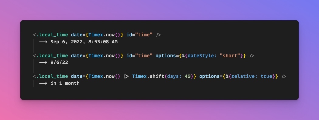
Local time hook ⏰
Allows UTC dates and times to be shown in the user’s local timezone (using Javascript). Supports “time_ago” formatting (eg. “in 1 month”).
Use Docker for a local Postgres 🐳
If your system doesn’t have Postgres you can use docker-compose to run it in a container (saves you having to install it).
New recipe: NPM 👨🍳
We understand that some people need to use third-party Javascript libraries and prefer to use NPM to manage them over CDNs. This recipe will get you up and running with NPM quickly.
July, 2022
Petal Pro
You can watch the video of all updates here.
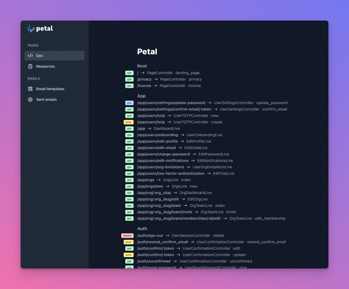
New components: Data Table & Route Tree 🧪
The route tree shows all of your routes in a simple format. You can also copy the route helper by clicking a row.
The data table gives you a table view with sorting, filtering and pagination built in. The state is stored in the URL params.
Streamlined router
The router was a bit overwhelming so I’ve cut it down to just 92 lines. I split out some of the routes that don’t change as much into their own files (eg. auth, dev, auth routes).
Improved quality standards
I’ve added a new command mix quality. This runs three tasks:
-
mix coverallsto report your test coverage -
mix credoto analyse your code and look for common problems -
mix sobelowto look for potential security issues in your code
Ideally before you push your code you should run this command (along with mix format).
Content Security Policy
mix sobelow revealed to me that no Content Security Policy was being set by Phoenix. It is generally favourable to have these set to prevent XSS attacks.

You will see this in the router:
plug(:put_secure_browser_headers, %{
"content-security-policy" =>
ContentSecurityPolicy.serialize(
struct(ContentSecurityPolicy.Policy, PetalPro.config(:content_security_policy))
)
})
Basically, in your config you need to whitelist any website you download assets from.
config :petal_pro, :content_security_policy, %{
default_src: [
"'unsafe-inline'",
"'unsafe-eval'",
"'self'",
"https://cdnjs.cloudflare.com",
"https://cdn.skypack.dev",
"https://rsms.me",
"https://res.cloudinary.com/"
]
}
Unfortunately Alpine JS needs “unsafe-eval” to work. Because of this I have a goal to eventually remove Alpine JS altogether. The A in PETAL will have to represent “and”. Or maybe “Ash” if we end up implementing their framework.
New JS hook helpers
- Dead view compatible hooks
Sometimes you want hooks to run in dead views. For example, I may want to run my tooltip library “tippy” on the landing page, which is dead (not a live view). Normally hooks can only run in a live environment, however I made a small change in app.js to run dead view compatible hooks when the page loads. This is great for small hooks that don’t communicate with a live view and just do some DOM manipulations.
import loadExternalFile from "../lib/load-external-file";

const TippyHook = {
deadViewCompatible: true,
mounted() {
this.run(this.el);
},
updated() {
this.run(this.el);
},
run(el) {
loadExternalFile([
"https://cdnjs.cloudflare.com/ajax/libs/tippy.js/6.3.7/tippy.min.css",
"https://cdnjs.cloudflare.com/ajax/libs/popper.js/2.11.5/umd/popper.min.js",
"https://cdnjs.cloudflare.com/ajax/libs/tippy.js/6.3.7/tippy.umd.min.js",
]).then(() => {
tippy(el);
});
},
};

export default TippyHook;- Dynamically load external libraries
As you can see in the “tippy” hook code above, I run a function loadExternalFile that takes an array of URLs. This will fetch the files, but cache them so they only get fetched once. Even if you have 100 tooltips on one page, these external files will only get loaded once.
This is great because we can now easily plug in any NPM library and start using it without a build system.
Using a build system (ESBuild) and creating a package.js file to host 3rd party libraries to me is less favourable. I like not having Node as a dependency - your web app is easier to install and just feels lighter.
- Oban jobs table
Next up we have an Oban jobs table. This simply is a simple version of Oban Pro. You can see your jobs and retry or cancel jobs.

May, 2022
Petal Pro
Petal Pro v1.2.0 is now available to download for our subscribed members 👏
Social logins (Oauth2 SSO)
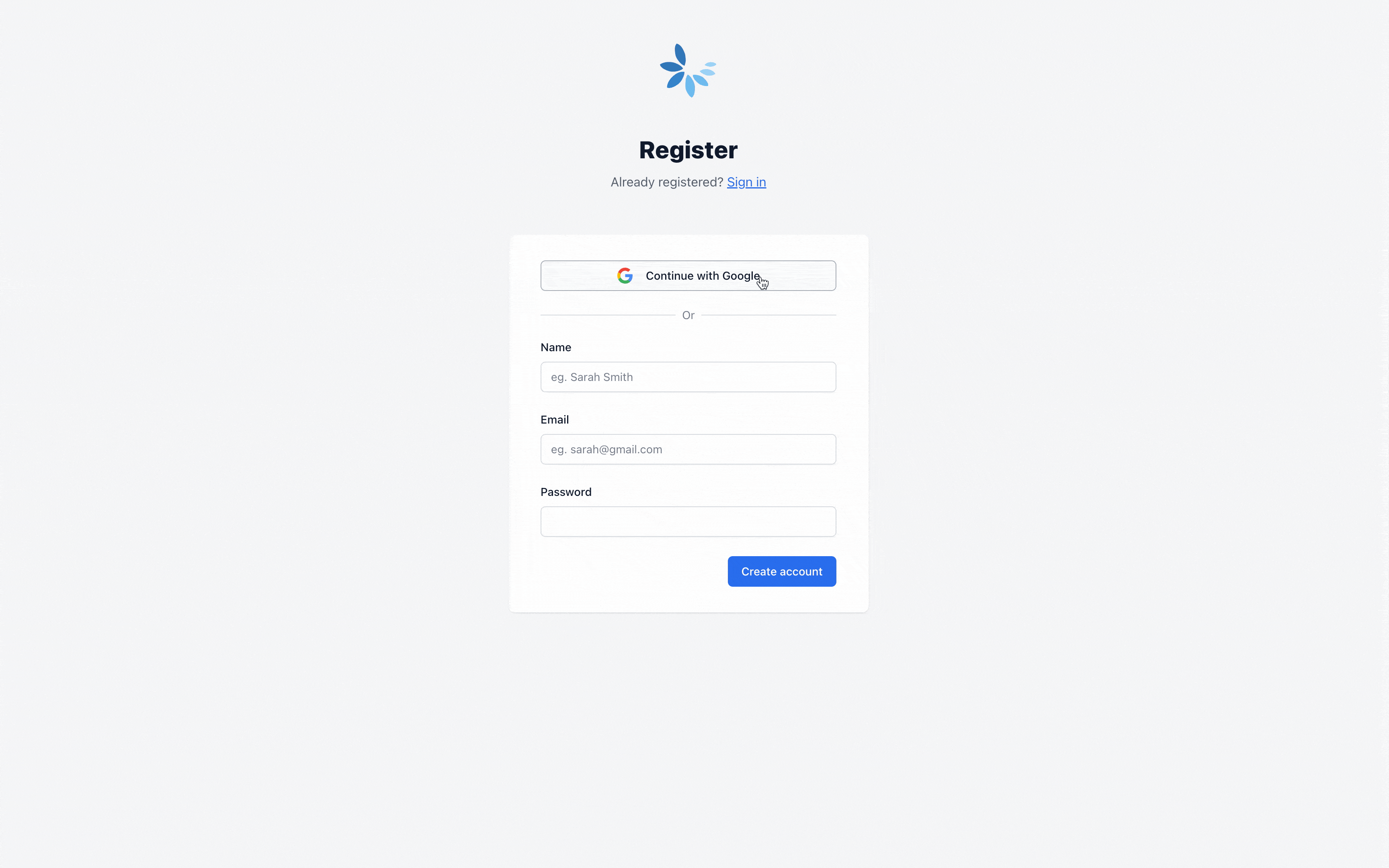
We’ve included Google & Github to get you started and make it super easy for you to enable login with any other OAuth provider you might want add to your app.
We’ve also included our very first Petal Pro component <.social_button> that produces beautiful social login buttons in two variants (“solid” and “outline”). Social button currently supports:
- Github
- Apple
Passwordless auth
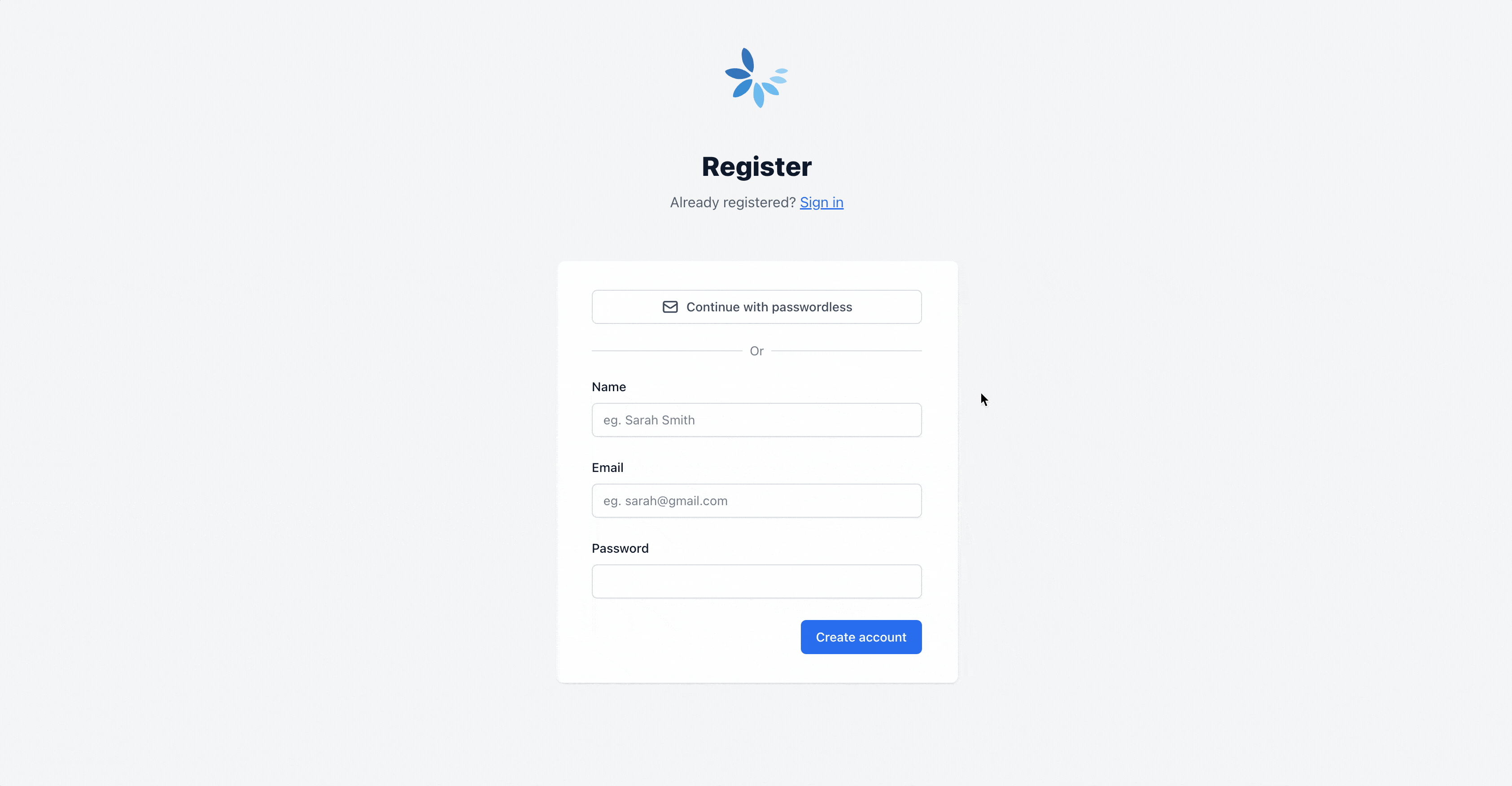
Users of your app can now register/sign in via a pin code sent to their email. It’s simple to enable or disable at any time.
Multi-tenancy
You can now optionally create an organization, invite & manage members, and more.
User lifecycle actions Run code after actions like register, sign_in, sign_out, password_reset, etc
New generator mix petal.gen.html (same args as phx.gen.html)
New component <.markdown content=””> & <.pretty_markdown content=””> (uses Tailwind Typography plugin)
Added License and Privacy pages Includes some content from a template to get you started
New layout <.layout type=”public”> For public marketing related pages like landing, about us, privacy, etc
Hooks can now be run in dead views if compatible (see color-scheme-hook.js as an example)
For a quick overview on upgrading from v1.1.0, please refer to this guide.