Petal Design
The Petal stack gives an agent three things: components that already look right, an MCP server with exact schemas, and a skill that carries the design doctrine no schema can. Below, the same settings-page prompt, one attempt each, in a fresh Phoenix app versus the Petal stack. Drag the divider, or focus it and use the arrow keys.
MIT licensed, nothing to sign up for. Prefer the components first? Browse the library
213 components mcp.petal.build petal-design skill
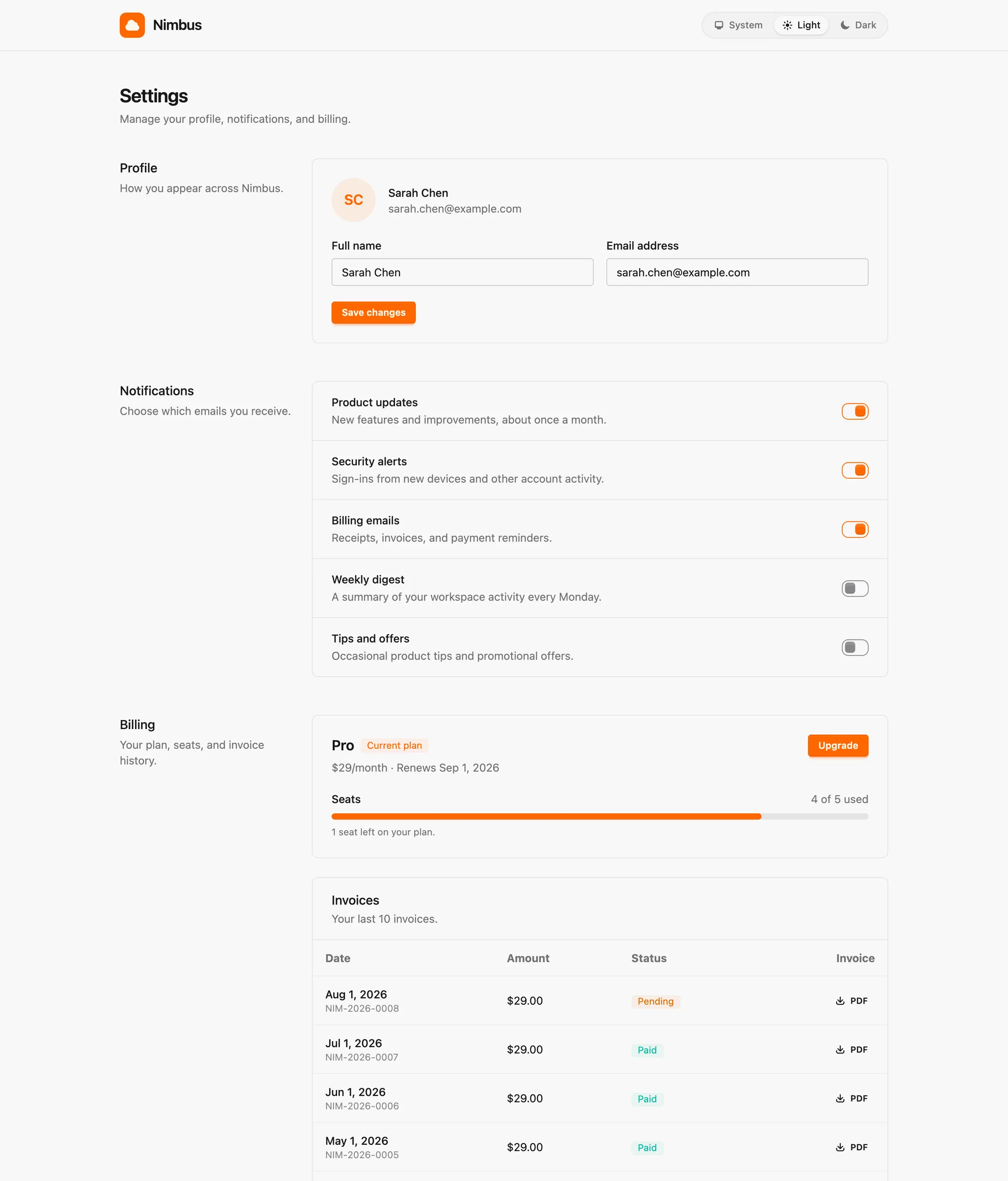
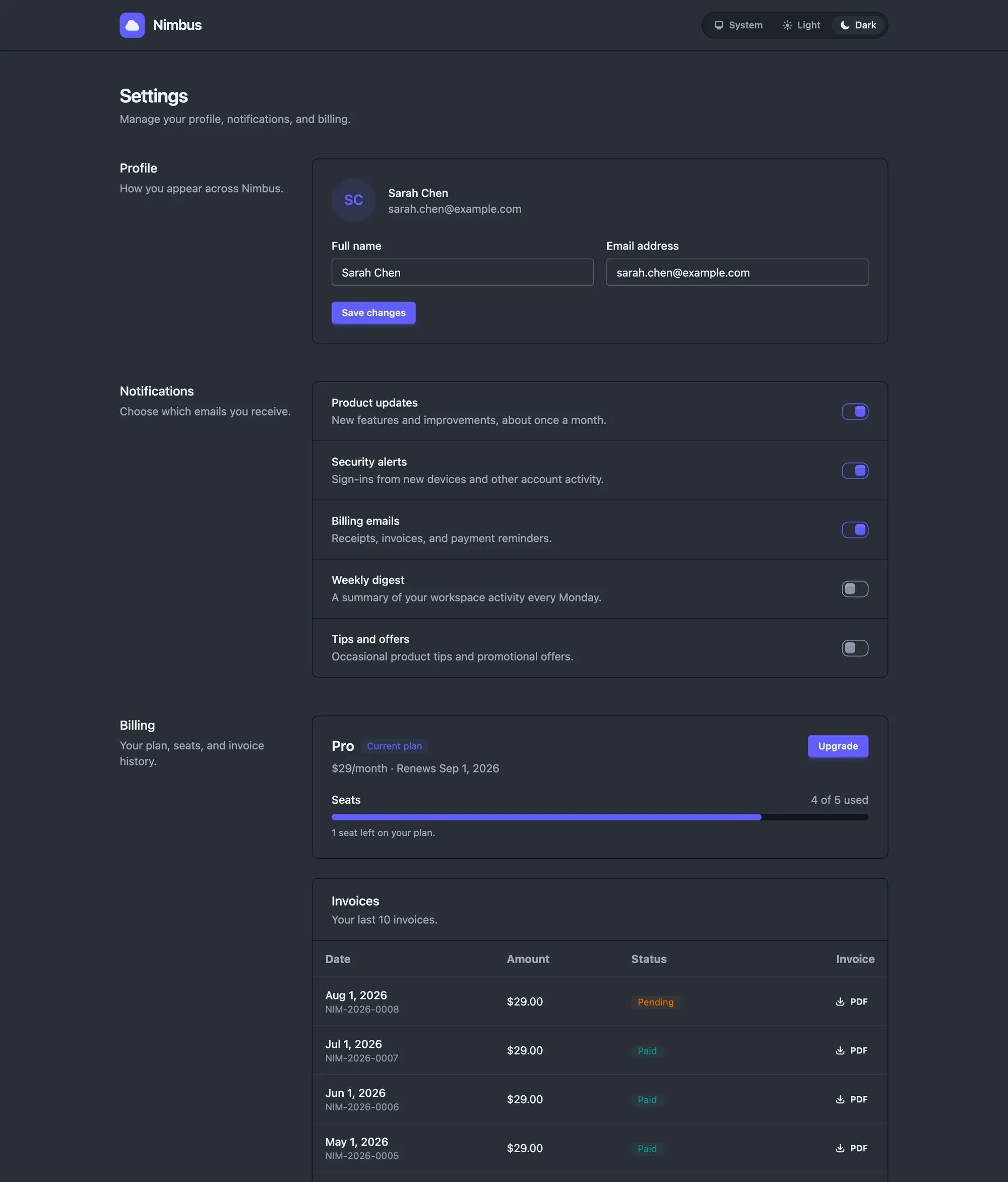 Fresh app
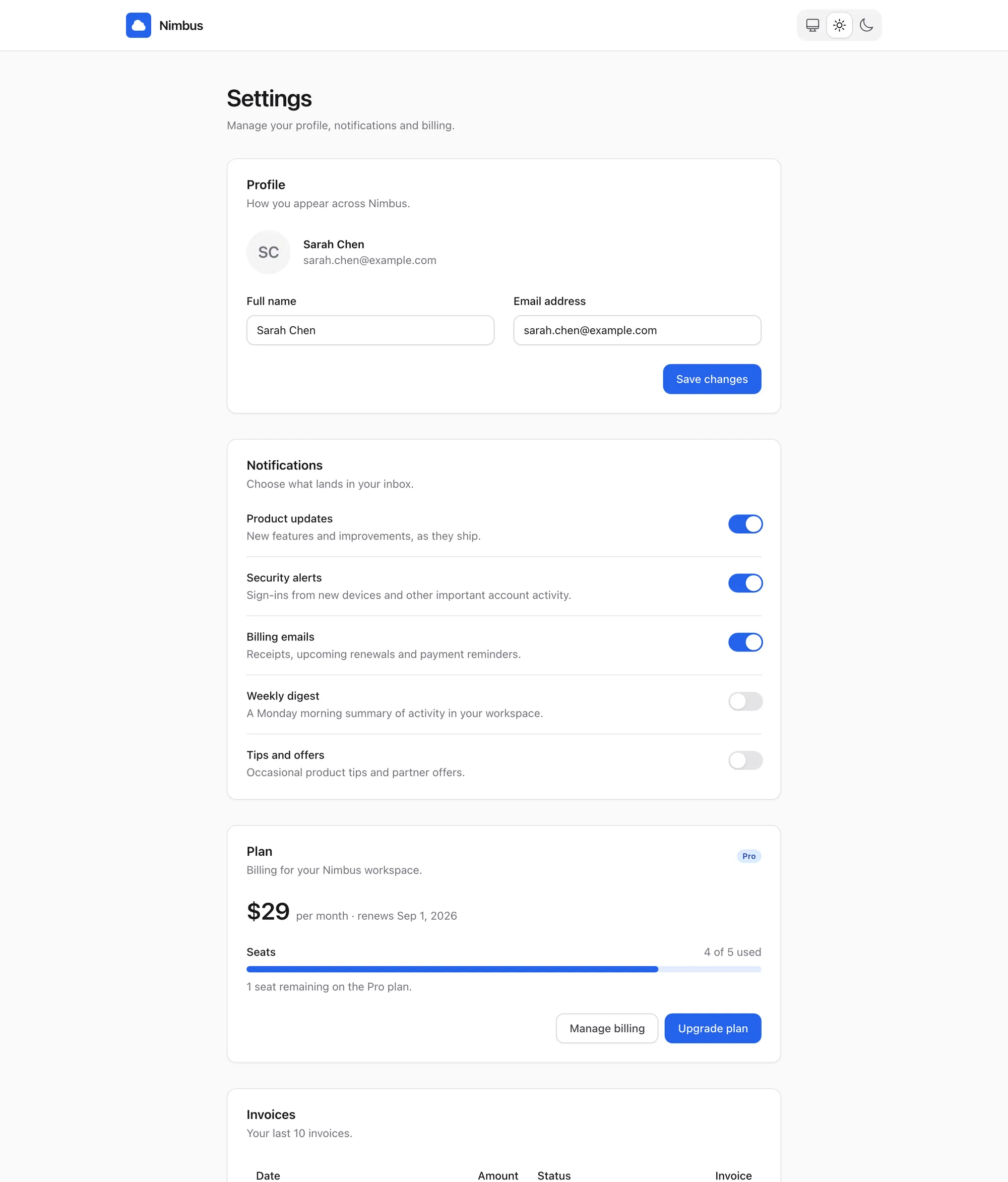
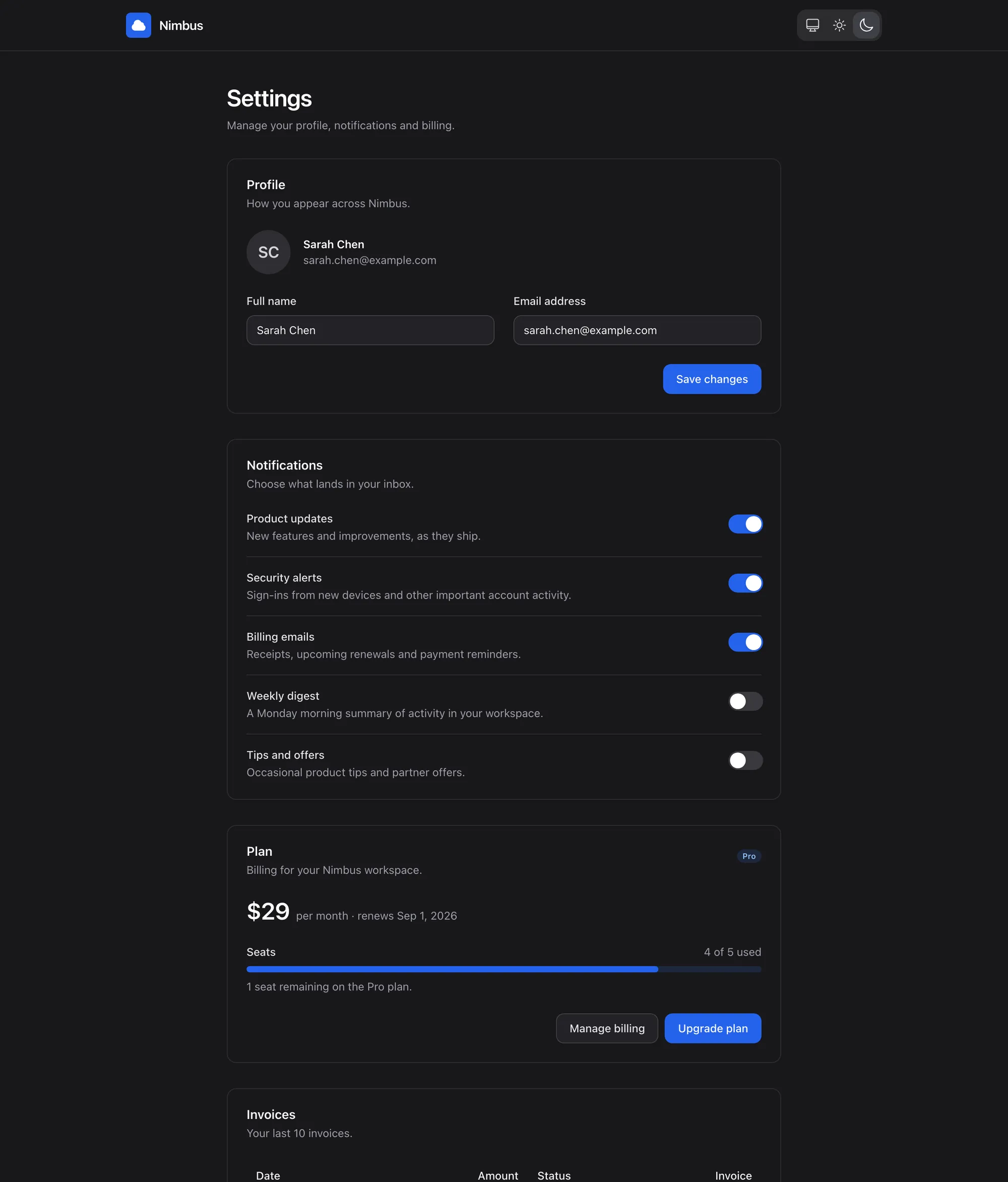 Petal stack
Build a settings LiveView at /settings: app navbar with the product logo on the left and a theme switcher on the right (System / Light / Dark segmented control); profile section (name, email, avatar); notification toggles; and a billing section with a table of the last 10 invoices (date, amount, status, PDF link) plus a plan card showing seat usage (4 of 5 seats) with a usage progress bar and an upgrade button. Support light and dark mode.
Identical prompt and seed data, one attempt each, screenshots untouched. The two sides are different apps by construction: a just-generated Phoenix 1.8 app on the left, the Petal stack on the right.
The stack
An agent writes two kinds of code: calls to components the library ships, and the custom markup in between that no library ships. Petal guards each one differently, and points both at the same tokens. That is why the result coheres instead of being two styles glued together.
Before and after
Everything below is rendered live by petal_components on this page, not screenshots. Pairs badged "verbatim eval output" are real eval material; the rest are labelled doctrine illustrations. Drag each divider, or focus it and use the arrow keys.
Task: convert a hand-rolled invoices view. Before: the fixture - literal zinc palette, raw table, hover:opacity on a solid. After: the skill arm's conversion - table, soft badge, and the confirm becomes a real alert_dialog.
| Date | Amount | Status |
|---|---|---|
| 2026-08-01 | $29.00 | paid |
| 2026-07-01 | $29.00 | paid |
| 2026-06-01 | $29.00 | paid |
| Date | Amount | Status |
|---|---|---|
| 2026-08-01 | $29.00 | paid |
| 2026-07-01 | $29.00 | paid |
| 2026-06-01 | $29.00 | paid |
Both sides are identical HEEx. The after side sits inside one wrapper carrying the amber primary, the stone gray dial, and a zero radius token - in an app that is a single theme block, and the skill's theme mode writes it for you. Retro, corporate, brutalist: the dials do not care.
The AI-slop tells the review playbook hunts: kicker caps, italic display serif, side-tab border, off-system cream, hardcoded radius. After: the same content on the system - token surface, house type, one accent.
Your team is almost out of seats.
9 of 10 member seats are in use across two workspaces.
Task: add dark mode to a light-only card. Before: the MCP-only arm - schema access carries no styling doctrine, so it inverts to opaque gray-800/gray-600. After: the skill arm lands the ghost ladder exactly - dark chrome as alpha-of-gray-400. Both sides render forced-dark on purpose: the task under eval is dark mode, so the site theme deliberately does not affect this pair.
Rotate keys regularly.
Rotate keys regularly.
Measured
The Dark mode pair above, at the class level. The task: "Add dark mode to this view. Light styling stays exactly as is." Both arms had the component schemas. Only one had the doctrine. Outputs are verbatim.
<div class="rounded-lg border border-gray-200 bg-white p-6 shadow-xs
  dark:border-gray-700 dark:bg-gray-800">
  <h3 class="font-semibold text-gray-900 dark:text-gray-100">API keys</h3>
  ...
  <input type="text" class="... border-gray-300
dark:border-gray-600 dark:bg-gray-800" />Valid classes, mechanical inversion: opaque gray-800 panels, gray-600 borders. It compiles. It is not the system.
<div class="rounded-lg border border-gray-200 dark:border-gray-400/17
  bg-white dark:bg-gray-900 p-6 shadow-xs">
  <h3 class="font-semibold text-gray-900 dark:text-white">API keys</h3>
  ...
  <input type="text" class="... border-gray-300
dark:border-gray-400/25 dark:bg-gray-400/8" />The system's dark material: translucent gray-400 surfaces, hairline borders, white headings. Nothing in a schema says this. The skill does.
Schema access closes the API gap: both arms write valid component calls. It does not carry taste. The difference between these two outputs is the entire reason the skill exists, and it is the part of your UI no library can ship: the markup in between.
The system
Each piece works alone. Together they are the stack from the diagram. The components and the MCP have their own page; the skill installs in two lines.
claude mcp add petal --transport http https://mcp.petal.build/mcp
claude plugin marketplace add petalframework/petal_components
claude plugin install petal-design
Or copy
deps/petal_components/skills/petal-design
into your project's .claude/skills/.
The doctrine, loaded only when your agent does UI work. Triggers itself; no command to remember. Cursor, Codex and the rest take the same MCP URL.
See every agent:root {
--pc-radius: 0;
--brand-600: oklch(0.666 0.179 58.318);
--color-gray-500: oklch(0.553 0.013 58.071);
--pc-font-body: ui-monospace, monospace;
}Primary ramp, gray dial, one radius knob, the dark material. Turn them in the playground and watch every component follow. The theme lives in the URL, so a look is a link you can share.
Open the playground213 surfaces with focus rings, dark pairs and the radius knob built in. Browse the components
Components, MCP and the skill are MIT and need no account. A free account adds:
Free account, no credit card. Prefer email?
3,383 developers on Petal 1.4M Hex downloads 606 projects registered

