

Petal Components 4.2.0: a big typography upgrade

Petal Components 4.2.0 reworks the type scale and adds 7 text components, so a Phoenix page reads like a designed page with no manual spacing.
- Name
- Matt
- @
23 days ago
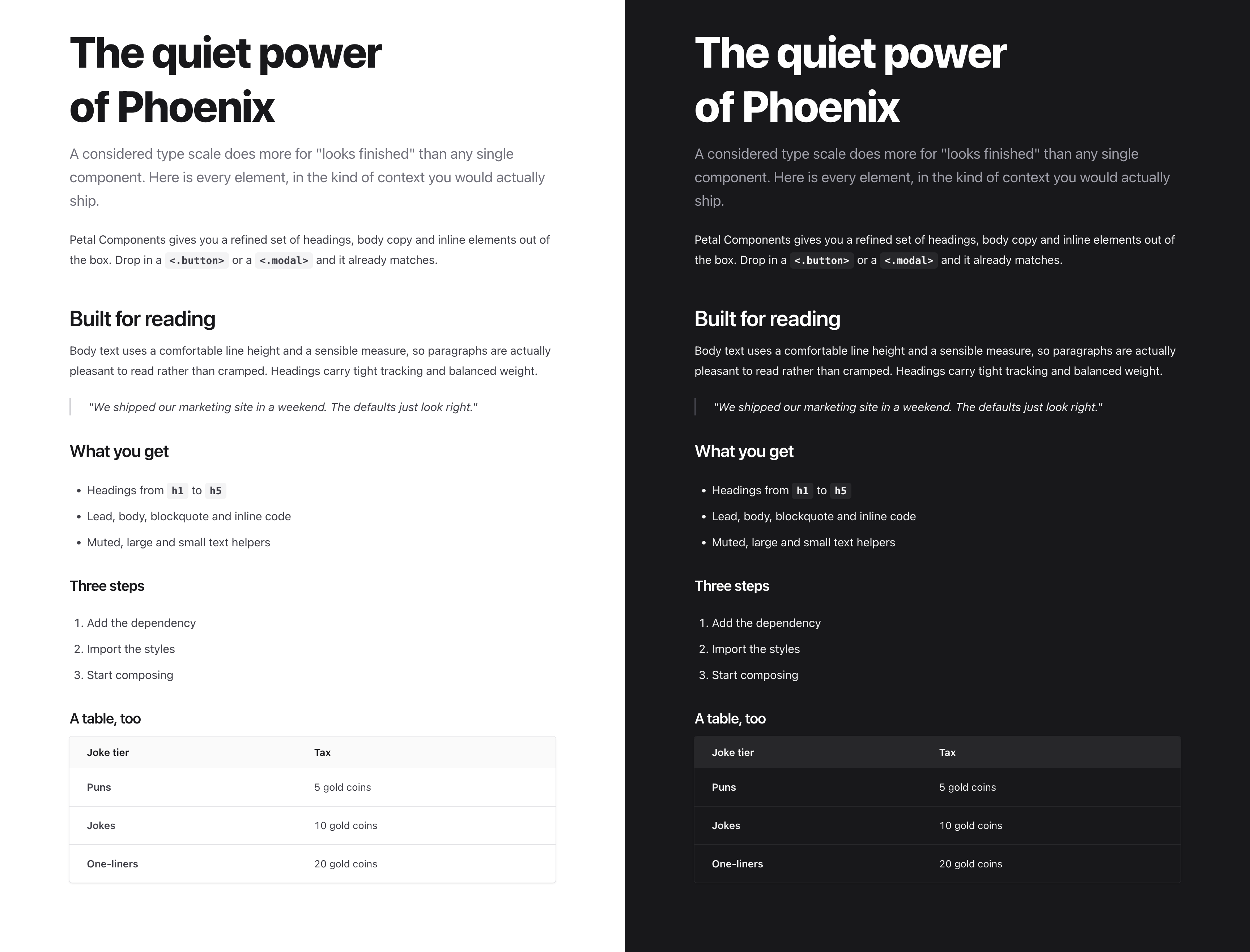
Typography is the cheapest way to make an app look finished, and the easiest thing to get subtly wrong. 4.2.0 is about getting it right in the defaults, so you do not have to think about it.
It reworks the whole type scale and adds 7 new text components: lead, blockquote, inline_code, text_large, text_muted, text_small and hr. You can now lay out a full page from components alone, with no dropping to raw HTML and no hand-tuned Tailwind on every element.
Here is what actually changed, and why each one matters more than it looks.
One emphasis scale, not a grab bag
Text used to pick up colour a bit ad hoc. Now there are three deliberate tiers: strong for headings and the things that matter, default for body copy, and muted for captions and metadata.
Hierarchy is how people read a screen. Nobody reads top to bottom, they scan, and they need the page to tell them what matters before they commit to reading anything. Three consistent volumes do that without you reaching for bold on every other line. We also tuned all three tiers to hold up in light and dark, so the hierarchy does not collapse the moment someone flips the theme. That last part is the bit most component libraries skip.
Spacing that means something
Headings now bring their own rhythm: more room above a new section, a tighter gap down to the paragraph they introduce, and no orphan margin on the very first one.
Space is grouping. A bigger gap before a heading says “new section starts here”, and the tight gap after it ties the heading to the words underneath. Browsers do not do this for you, and getting it right by hand means fiddling with margins on every page you ever build. Set it once in the components and it just works everywhere.
Body text you actually want to read
Comfortable line height, a sensible line length, and smarter line breaks so you stop getting a single lonely word on the last line.
There is a real readability sweet spot, somewhere around 60 to 75 characters per line with line height near 1.7. Go wider and the eye loses its place on the trip back to the left. Go tighter and long paragraphs feel cramped. This is the quiet difference between a paragraph someone reads and one they skip.
Headings that look set, not typed
Larger text now gets slightly tighter letter spacing.
Letter spacing that looks fine at 16px looks loose at 36px. Tightening it is a small optical correction, and it is most of what separates a heading that looks designed from one that looks like default text scaled up.
Tables that read like data
Cleaner header, and the data sits brighter than the labels above it.
A table is a scanning tool. The header should step back and the numbers should come forward, so your eye lands on the values, not the column names. A small change, and much easier to read.
Why this is worth a release
You ship defaults about 90% of the time. If the defaults already know all of this, every page you build inherits good typography for free. No design system to stand up, no typographer on call, no afternoon lost to margins and line heights.
That is the whole point of Petal Components. It should look finished before you touch it.
See the full type scale, rendered live in light and dark, at petal.build/components/typography.
Grab it:
mix deps.update petal_componentsIf you have ideas for what to build next, I would genuinely like to hear them.
More posts


- Name
- Nicolas
- @nicolashoban

- Name
- Nicolas
- @nicolashoban


- Name
- Nicolas
- @nicolashoban

- Name
- Nicolas
- @nicolashoban

- Name
- Nicolas
- @nicolashoban