



Petal Components 4.6: AI chat, a ⌘K palette, and theme tokens

Petal Components 4.4 to 4.6: a streaming AI chat kit with no client SDK, a native-dialog command palette, aurora and border beam going free, theme tokens, and a forms overhaul. All free and open source.

- Name
- Matt
2 months ago
We’ve shipped a few releases without telling anyone properly, so here’s the catch up: petal_components 4.4, 4.5 and 4.6, all free and open source.
AI chat, the LiveView way
There’s a full AI chat kit now: streaming messages, tool calls, reasoning blocks, markdown replies, an autogrowing composer, message actions and starter chips.
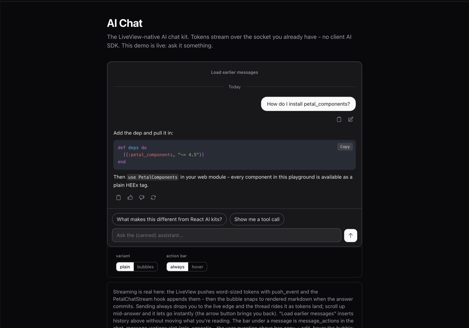
The thing that makes it different: there’s no client AI SDK. Your model streams to your LiveView process, you push each token to the bubble, and the bubble owns its own DOM so LiveView never re-renders over the text as it lands. You already have a socket. We used it.
Tool calls render as real Phoenix components, so your weather card or your table can have its own phx-click and its own state. The model emits data, you map the name to a component.
A ⌘K command palette
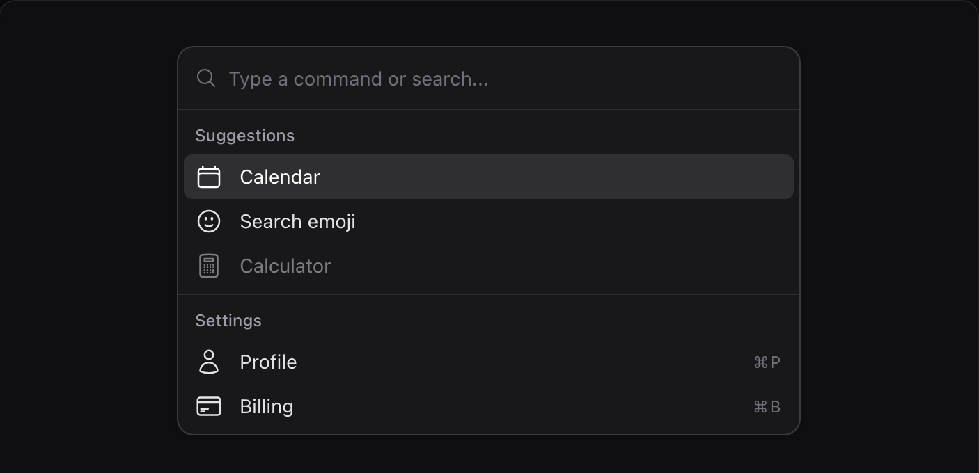
Built on the native dialog element, so the top layer, focus trap, backdrop and Escape all come from the browser for free. No portal hacks, and it escapes every overflow:hidden container you’ve got. Filtering happens client-side, so keystrokes never wait on the server.
Aurora and border beam, now free
Two ambient background pieces, both pure CSS, and both in the open source library now. Both came over from Petal Pro, and both got rebuilt on the way.
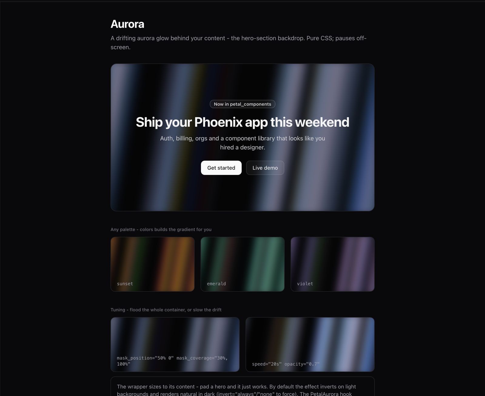
Aurora is a drifting glow you drop behind a hero: pass a palette of three to six colours and the gradient gets built for you. Border beam traces a light around a panel border, with glow, multiple beams and a spring easing. Both hold still for prefers-reduced-motion.
Theme tokens
Set --pc-radius in your CSS and every button, badge, input, select, checkbox, modal, dropdown and tooltip follows it. One custom property, whole library.
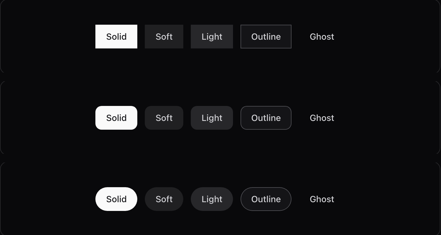
No config, no theme engine, no runtime theme object to fight. It’s CSS variables in your stylesheet. You own it.
A forms overhaul
Every form control sits on one shared surface system now, so dark mode is one material instead of a mix of grays. The error state calmed down: no more pink fills and red placeholder text. There’s an input_group for prefix/suffix addons, and an input_otp that’s one real invisible input stretched across painted segments, which is why paste and SMS autofill actually work.

Docs that can’t drift
Our examples used to be written twice, once in the playground and once on petal.build, and they drifted. So examples now live inside the package as compiled HEEx blocks. Both sites render the same registry, and because the examples compile against the real components, an example using a wrong attribute won’t build. The code you copy always matches the preview you’re looking at.
A few things to know if you’re upgrading
Nothing here breaks your API, but a few defaults moved:
- On Petal Pro? Take Pro 4.4.0 before you update petal_components. Pro used to ship its own aurora and border beam, so with both installed you’d get an ambiguous import error. Pro 4.4.0 deletes its copies and uses these ones instead. The upgrade guide has the details.
-
Chat renders full-width turns by default now (the ChatGPT/Claude look). Pass
variant="bubbles"for the old messaging style. -
navigation_menuopens on hover by default. Passtrigger="click"for the old tap-to-toggle. - 4.4 was a restyle. No API changes, but things look deliberately different: calmer error states, 16px checkboxes, one dark-mode material. If you’d built around the old look, you’ll notice.
-
Tailwind v4 only. If you’re still on v3, pin
petal_components ~> 1.0. -
If you use the chat’s markdown highlighting, you need
lumis ~> 0.6. 0.5.0 was incompatible with mdex and silently rendered your code blocks plain. -
Add the
@source notline for the showcase directory to your app.css, so Tailwind doesn’t scan our example modules into your CSS. Needs Tailwind v4.1+. Harmless to skip, you just carry a little extra CSS. -
The Chat family isn’t pulled in by
use PetalComponents(names likemarkdown/1would clash with yours). Alias it.
Have a look at the components, and if you’re building AI things in Phoenix, I’d really like to know what’s missing.
More posts

- Name
- Matt

- Name
- Matt


- Name
- Matt


- Name
- Nicolas

- Name
- Nicolas


- Name
- Franz Bettag
