



Charts for Phoenix, themed from your tokens

Petal Components 4.7 adds a declarative <.chart> built on Apache ECharts that themes itself from your design tokens, plus a zero-JavaScript <.sparkline> for inline trends.

- Name
- Matt
3 months ago
Petal Components has charts now. A <.chart> component built on Apache ECharts, and a tiny <.sparkline> for inline trends. Both free, both open source.
The idea is simple: a chart should be a plain Elixir map. No JavaScript per chart, no second data layer in the browser, no JSON endpoint to stand up next to your LiveView. You already have a socket. We used it.
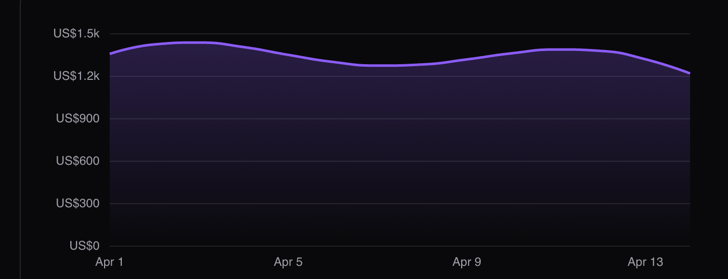
A chart is a map
You describe the chart as an Elixir map. It’s the ECharts option object, so anything the ECharts docs show you translates straight across. The whole spec lives server-side and travels the wire as data.
<.chart
  id="revenue"
  option={%{
    xAxis: %{type: "category", data: ~w(Mon Tue Wed Thu Fri Sat Sun)},
    yAxis: %{type: "value"},
    series: [
      %{
        type: "line",
        smooth: true,
        areaStyle: %{color: "petal:fade"},
        data: [820, 932, 901, 1290, 1330, 1520, 1710]
      }
    ]
  }}
/>
Update the assign and the chart animates in place. That’s the primary API and most of the time it’s the whole story.
def handle_info({:tick, points}, socket) do
  {:noreply, update(socket, :option, &put_in(&1, [:series, Access.at(0), :data], points))}
end
For high-frequency streams, where re-serialising the full option on every tick is wasteful, there’s a partial-update path that merges via setOption:
push_event(socket, "chart:update:revenue", %{option: %{series: [%{data: points}]}})Why ECharts
We didn’t want to write a charting library, and we didn’t want to wrap a thin one you’d outgrow. A few reasons it’s ECharts under the hood:
-
Canvas or SVG, your call. Set
renderer="svg"for crisp-at-any-zoom and print-friendly output, or leave it on canvas for large datasets. Same component, one attribute. - It holds 60fps on streaming data. A live tick shouldn’t turn into jank, and it doesn’t.
- There’s a real ceiling. Treemaps, heatmaps, candlesticks, graphs, the weird stuff you reach for six months into a dashboard. You won’t hit a wall and have to swap libraries.
- Apache governance. It’s an Apache project with actual governance behind it, not a single-maintainer package that goes quiet the week you depend on it.
We wanted a charting layer you could build a serious dashboard on and then stop thinking about.
It themes itself from your tokens
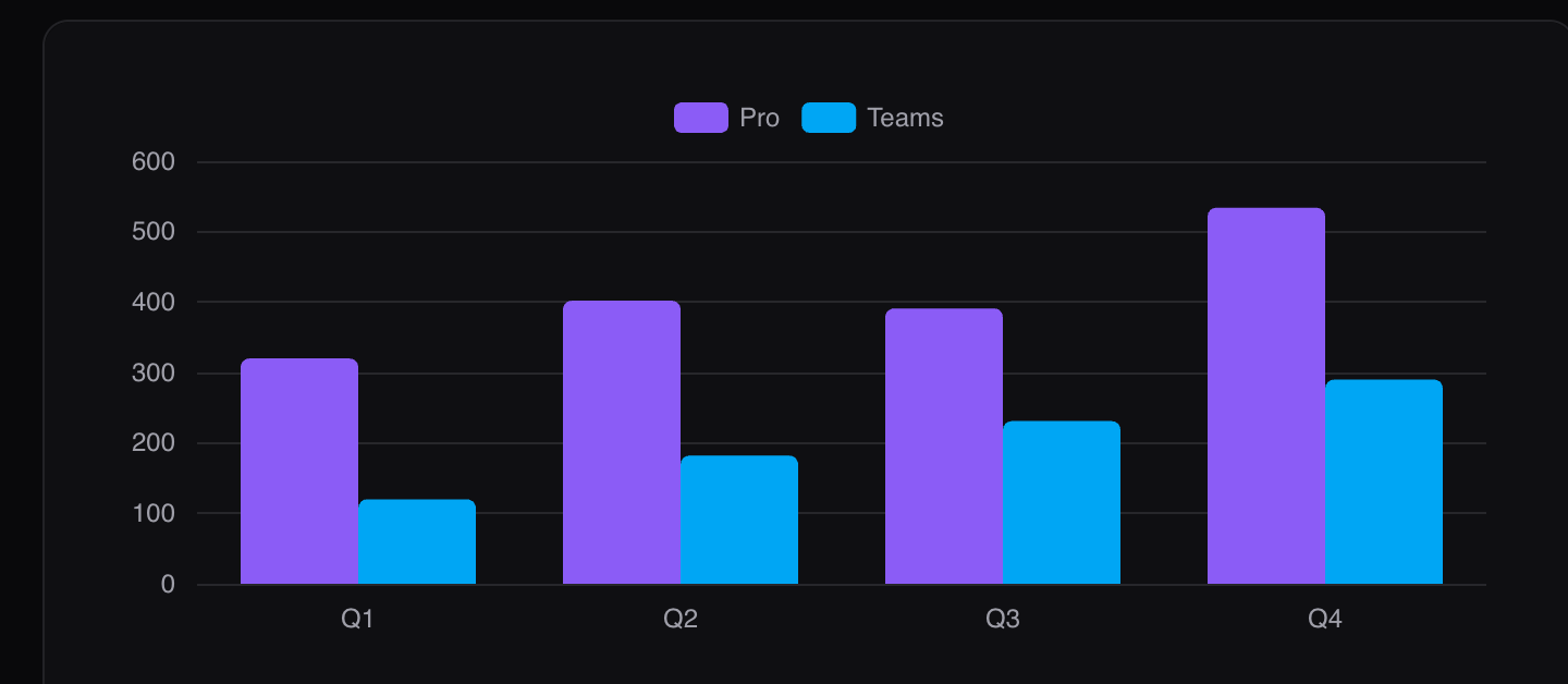
Colours resolve from your CSS custom properties at mount, the same dial as every other component in the library, light and dark.
-
Series palette reads
--pc-chart-1through--pc-chart-8if you define them. If you don’t, it derives a palette from your semantic ramps (primary, info, success, warning, danger, secondary), and demotes any ramp whose hue collides with an earlier pick so adjacent series stay distinct. - Axes, labels, gridlines and tooltips derive from your gray ramp, using the same ghost-material alphas as the rest of the library in dark mode.
Anything you set explicitly in the option wins over the derived theme. And when dark mode flips or a theme attribute changes above the chart, it re-derives and recolours on its own. If you retheme some other way, dispatch window.dispatchEvent(new Event("petal:retheme")) and it catches up.
The defaults are the modern dashboard look out of the box: label-only axes, horizontal-only gridlines, rounded bar ends, dotless lines with a hover point, a tooltip that follows your radius token.
Named formatters
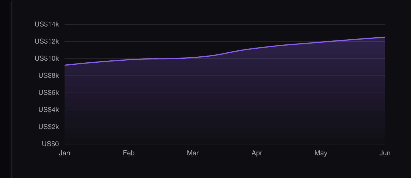
Here’s a genuinely annoying problem with server-side charts. ECharts formats numbers with JavaScript callback functions, and a function can’t travel the LiveView wire from your server.
So we added named formatters. Anywhere ECharts accepts a formatter or valueFormatter, pass one of these strings and the hook substitutes an Intl.NumberFormat-backed function on the client:
-
"petal:number"- compact: 1234 becomes “1.2K” -
"petal:percent"- 8.3 becomes “8.3%” -
"petal:currency:USD"- full: 12480 becomes “$12,480” (any ISO code) -
"petal:currency-compact:USD"- for axes: 12480 becomes “$12K”
<.chart
  id="mrr"
  option={%{
    xAxis: %{type: "category", data: ~w(Jan Feb Mar Apr May Jun)},
    yAxis: %{axisLabel: %{formatter: "petal:currency-compact:USD"}},
    tooltip: %{trigger: "axis", valueFormatter: "petal:currency:USD"},
    series: [
      %{type: "line", smooth: true, data: [9200, 9840, 10100, 11200, 11900, 12480]}
    ]
  }}
/>
Money on the axis, money in the tooltip, and not a line of JavaScript in your codebase.
The other convenience in the same spirit: areaStyle: %{color: "petal:fade"} renders that soft vertical gradient fade in the series’ own colour, so you get the polish without knowing the resolved palette.
More than lines
It’s the full ECharts range, themed. A donut with a total dropped in the hole:
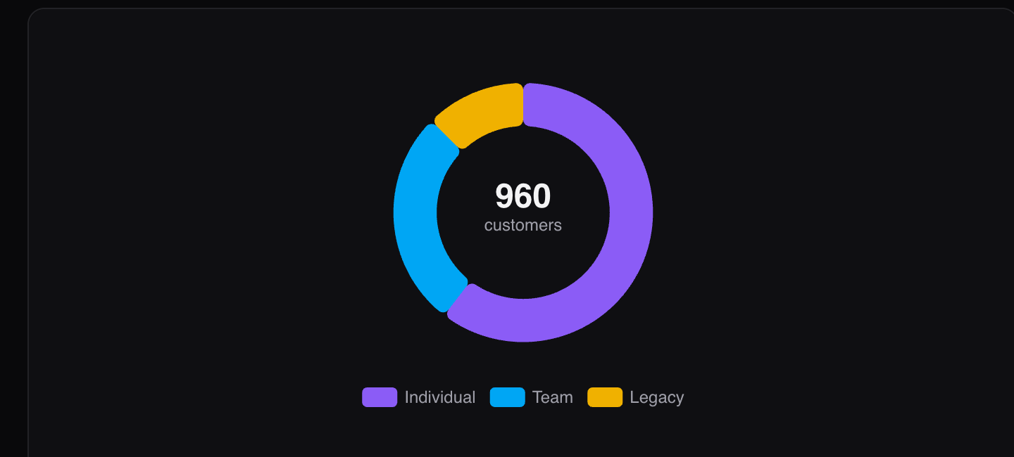
Grouped bars, stacked areas, pies, candlesticks, heatmaps - same component, same map, same theming.
How it works
Three pieces, and none of them are complicated.
The option map. You write the chart as an Elixir map and the component JSON-encodes it into a data attribute. The spec is server state, so re-assigning it and letting LiveView diff the attribute is all it takes to update the chart.
The hook. A bundled PetalChart hook reads that attribute, finds ECharts on window.echarts, and calls setOption. When the attribute changes it merges the new option and ECharts animates the transition. The engine is bring-your-own, exactly like Alpine: you add ECharts (a script tag or npm i echarts), the hook picks it up, and it warns if it’s missing.
Tokens at mount. On connect the hook reads your resolved CSS custom properties (the --pc-chart-* palette, your gray ramp) and injects them into the option. Flip dark mode and it re-reads and recolours. Nothing about your theme is baked into the chart spec, which is why one chart definition looks right in both modes.
There’s a loading spinner attr for async data, a group attr that connects tooltips and zoom across charts, and ECharts’ aria description generation is on by default.
The sidekick: <.sparkline>

Not every trend needs a full chart. Sometimes you want a line in a stat card, and pulling in a charting engine for that is silly.
<.sparkline> is pure server-rendered SVG. Zero JavaScript, so it works anywhere HTML renders: stat cards, table cells, email.
<.sparkline data={[8, 9, 9, 11, 10, 12, 13, 14]} class="w-24 h-8 text-primary-500" />
Catmull-Rom smoothing (or straight segments if you’d rather), an optional soft area fill, and a currentColor stroke so a text class sets the colour. The stroke is non-scaling, so any CSS size keeps the line weight.
We ran it in our own dashboard first
Before this shipped, we rebuilt the petal.build admin dashboard on it: three synced traffic bands and a revenue chart, live data, dark mode. The point was to find the gaps before you do. We didn’t hit any, and the synced-tooltip group attr came directly out of wanting those three traffic charts to move together.
Install
Bump the dep:
# mix.exs
{:petal_components, "~> 4.7"}
Then bring the engine. We don’t bundle ECharts, the same way we don’t bundle Alpine, so add it however you like:
<script src="https://cdn.jsdelivr.net/npm/echarts@5/dist/echarts.min.js"></script>or
// app.js
import * as echarts from "echarts"
window.echarts = echarts
The PetalChart hook finds it on window.echarts and you’re charting. Full steps are in the install rules.
Have a look
https://petal.build/components
If you build dashboards in Phoenix, I’d like to know what’s missing. Open an issue, or just reply.
Cheers, Matt and Nic
More posts

- Name
- Matt

- Name
- Matt


- Name
- Matt


- Name
- Nicolas

- Name
- Nicolas


- Name
- Franz Bettag
